TRANSFORMATIVE REPAIR
JAM FACTORY ~ 2024
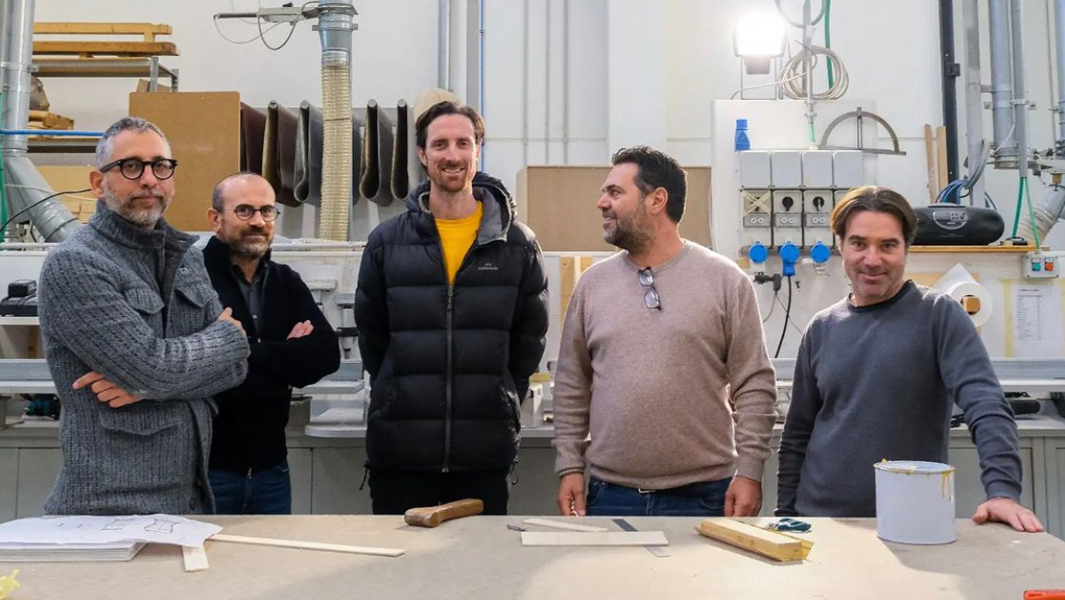
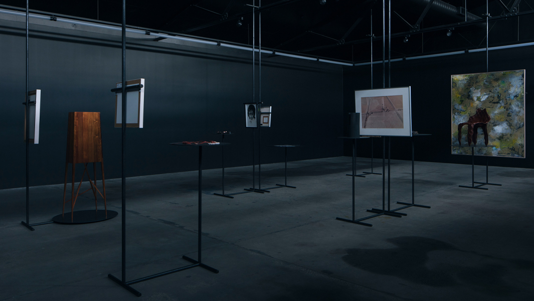
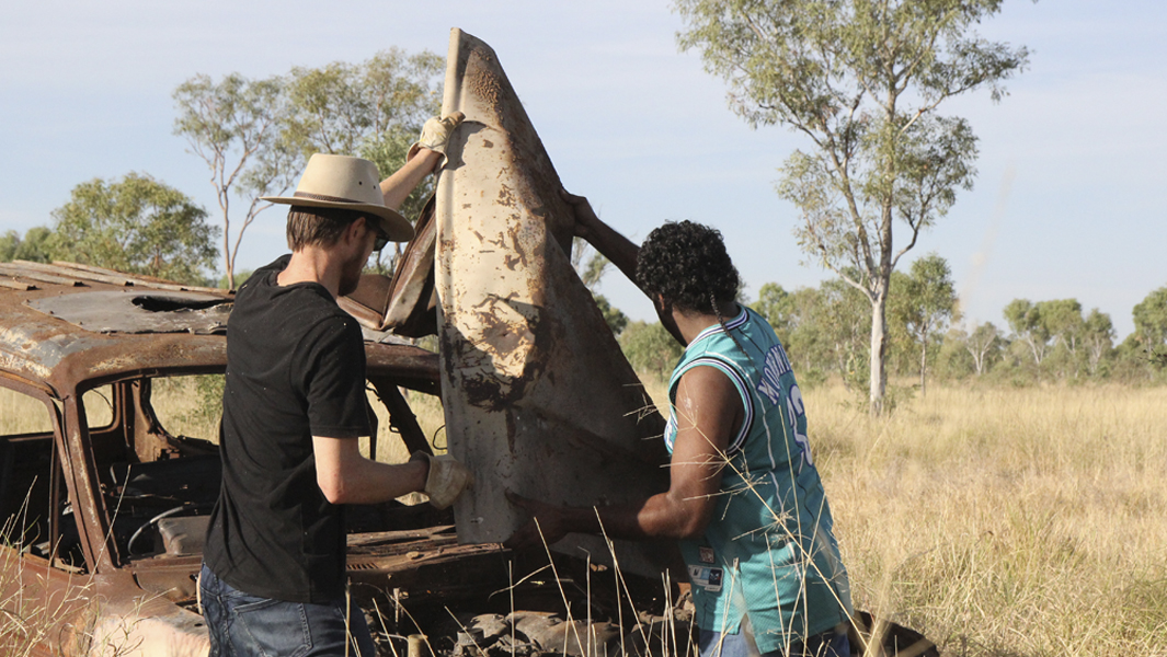
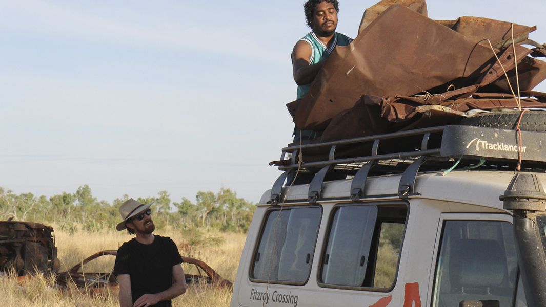
Between April 5th and April 21st, 2024, Jam Factory hosted our Australian Research Council funded research on creative forms of repair and reuse. This phase explores the conceptual and applied practices of designers, craftspeople and visual artists in relation with owners of broken objects, as clients, mediated by the researchers.
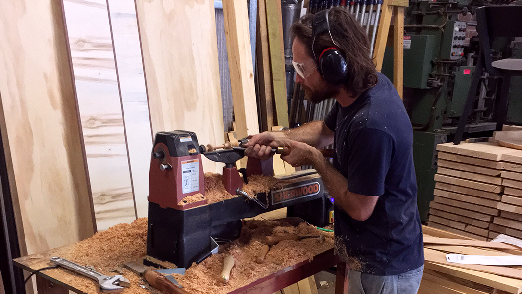
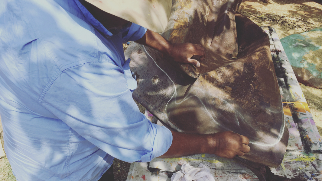
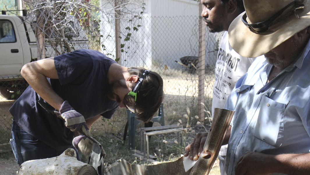
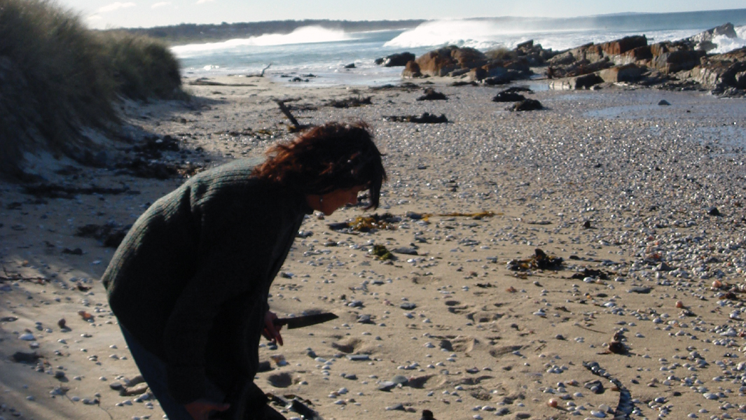
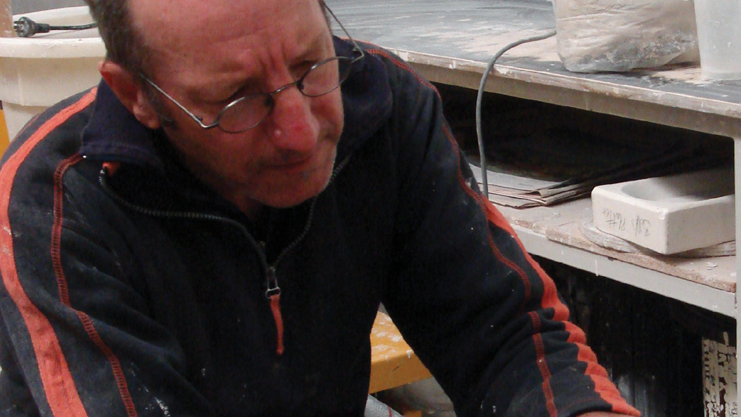
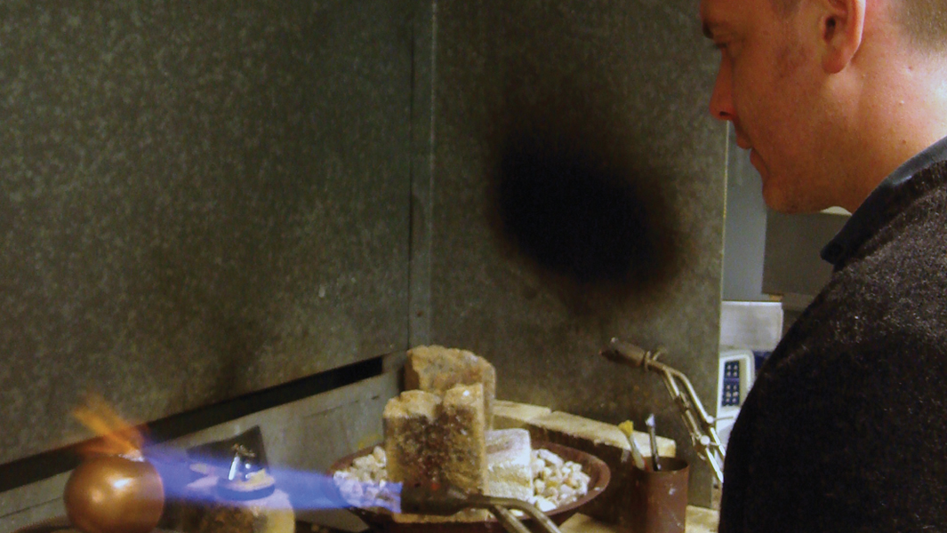
Transformative Repair x JamFactory began with a motive to understand the relations between the owners of broken objects, and the artists, designers and craftspeople that repair those objects. As a research method, we inserted ourselves between these parties as observers and mediators. We discovered that many owners give a great deal of freedom to repairers to change and transform their possessions as they see fit. Others took a more active role, providing notes, requests and inspirations. But what we see in all these beautiful things that have re-emerged into the world, from within the chrysalis of the repairer’s studio, is a concern for care. Care for materiality, style, history, culture, attachment, creativity and memory.
Contributors include:
Peta Kruger – Using her meticulous skills as a former jeweller, multi-disciplinary craftsperson Peta Kruger has functionally repaired these Louis Vuitton bags with subtle, minimal decoration. Owned by Chris.
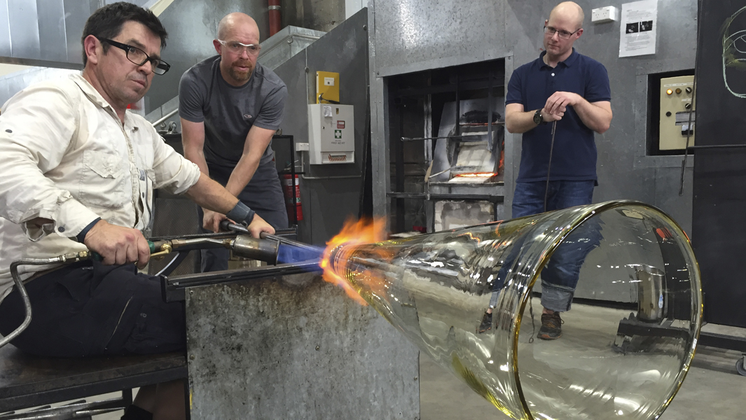
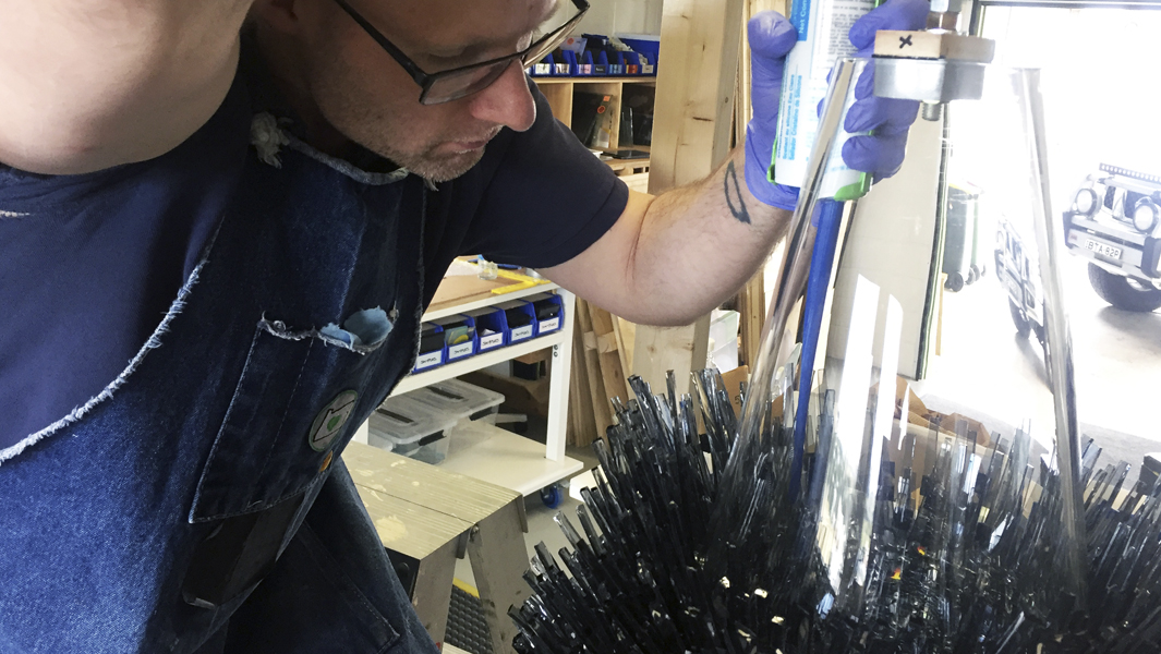
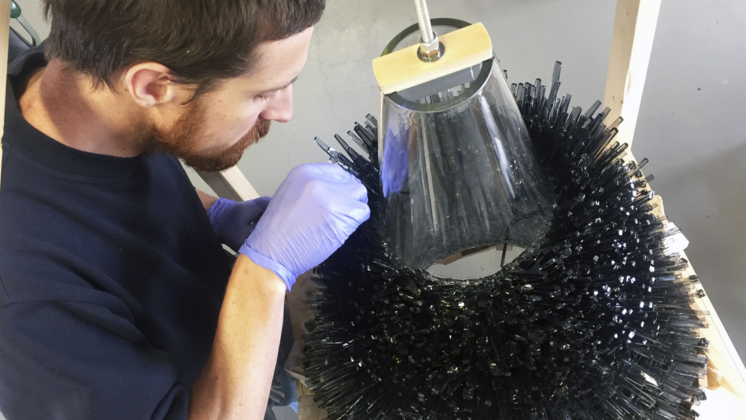
Tom Moore reimagines the materials of broken glassworks into a playful figure of dog balancing a strawberry on his nose. Owned by Paula.
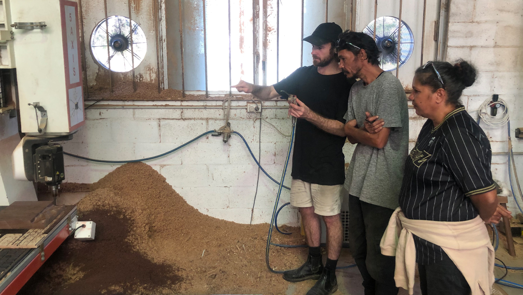
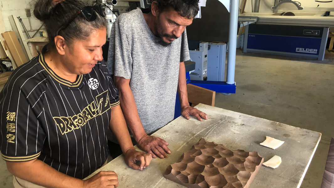
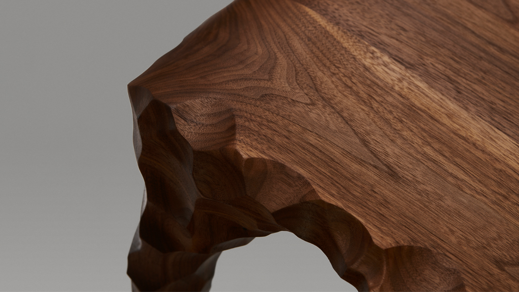
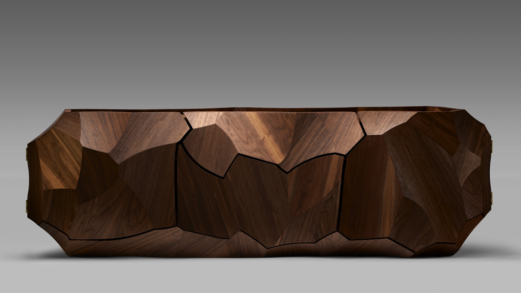
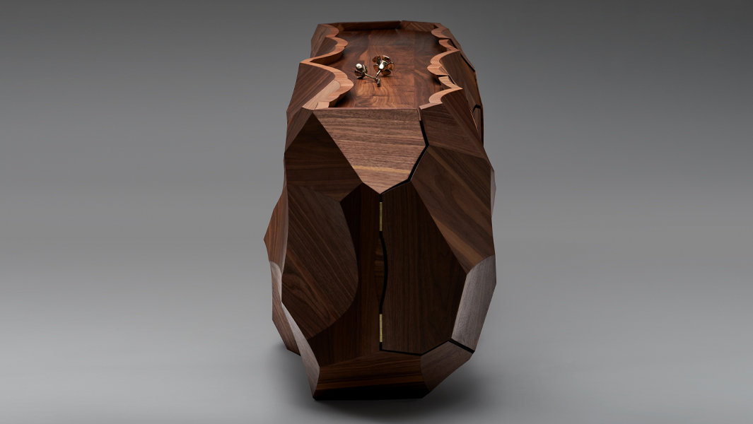
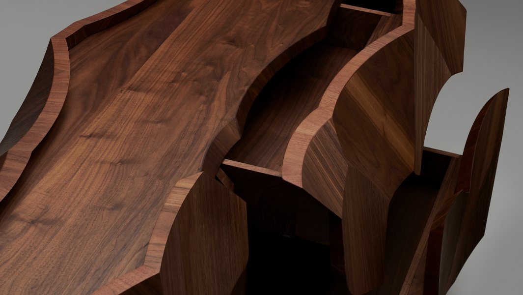
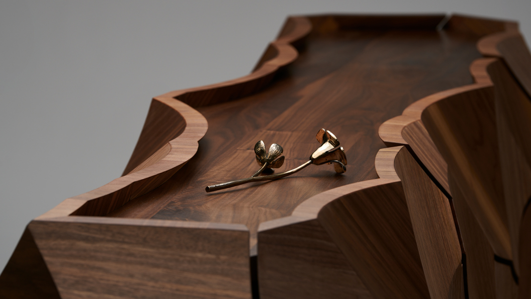
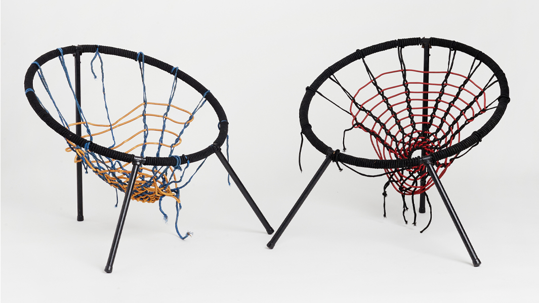
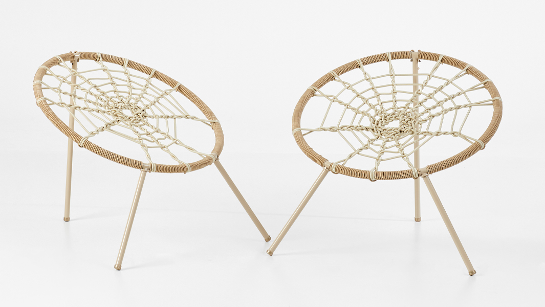
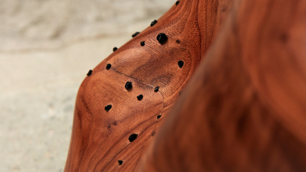
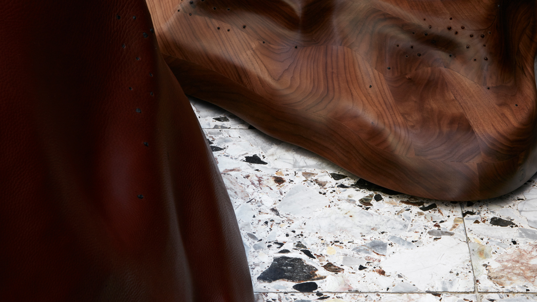
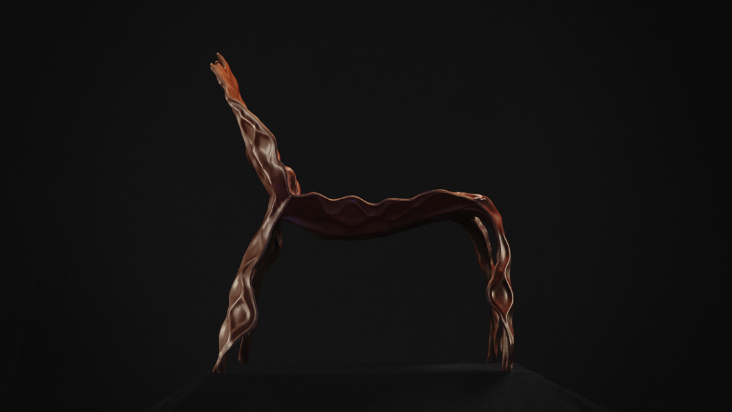
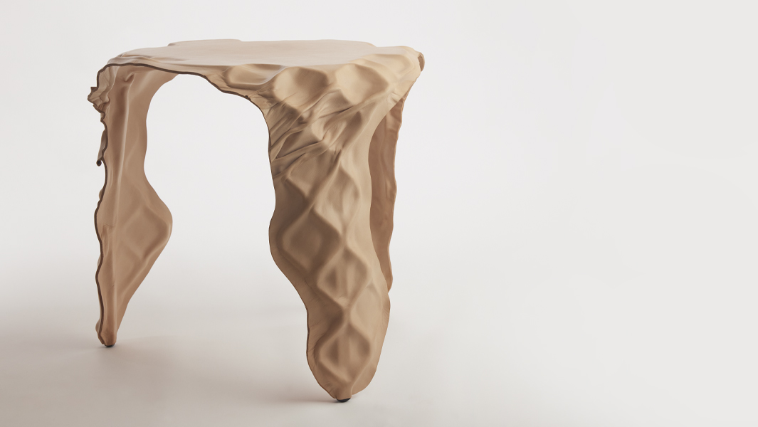
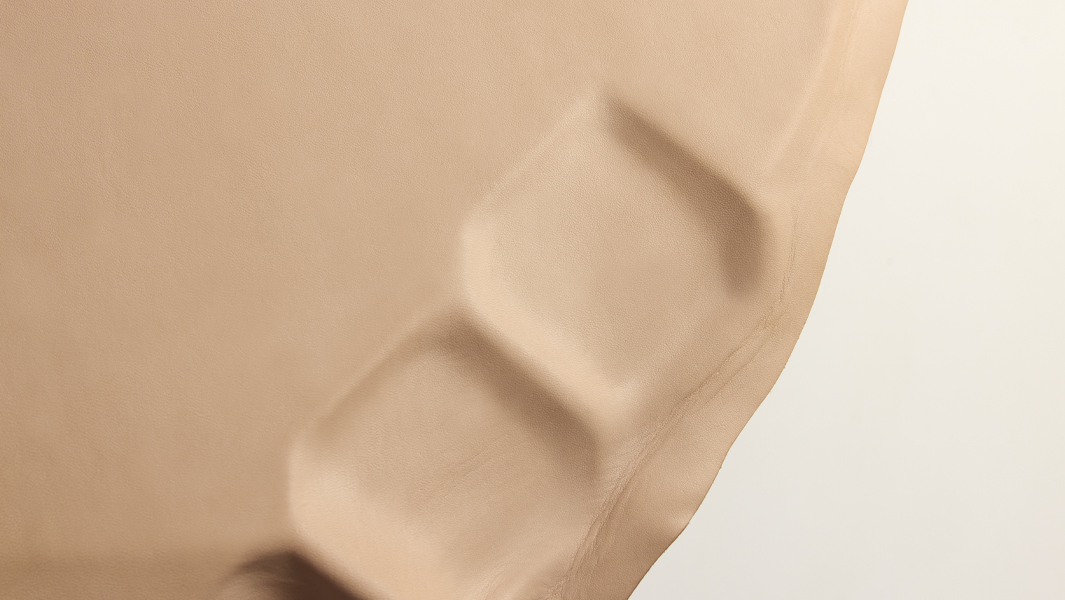
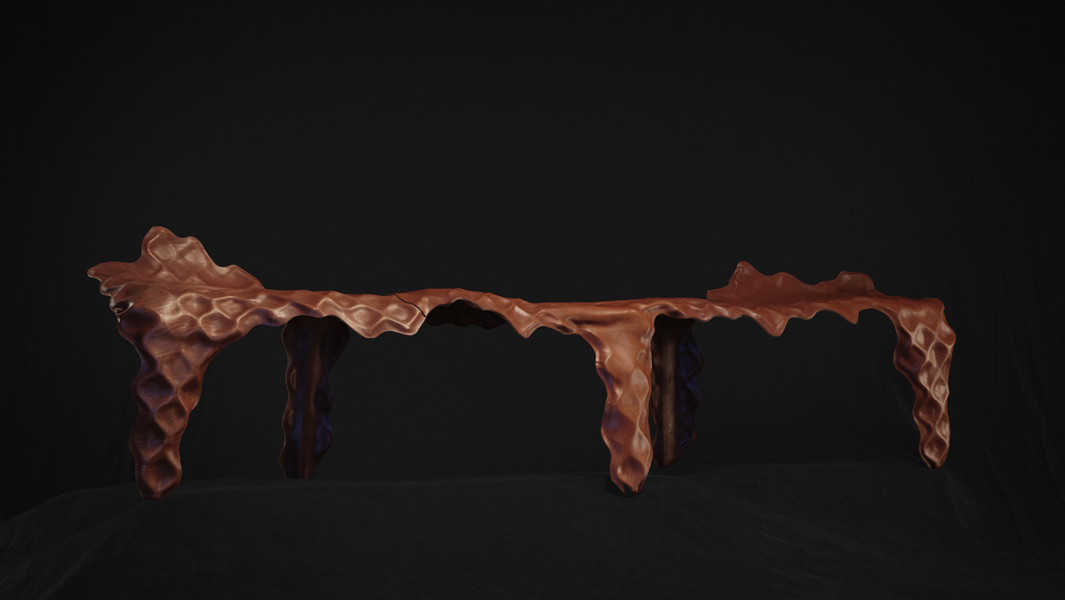
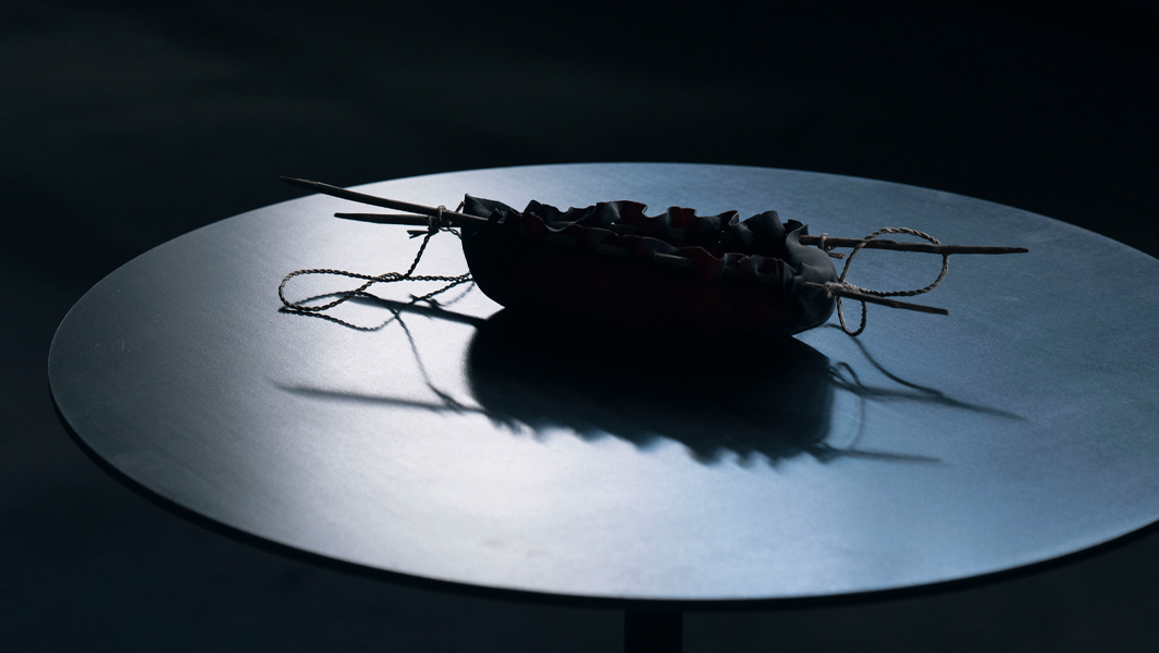
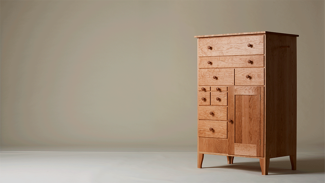
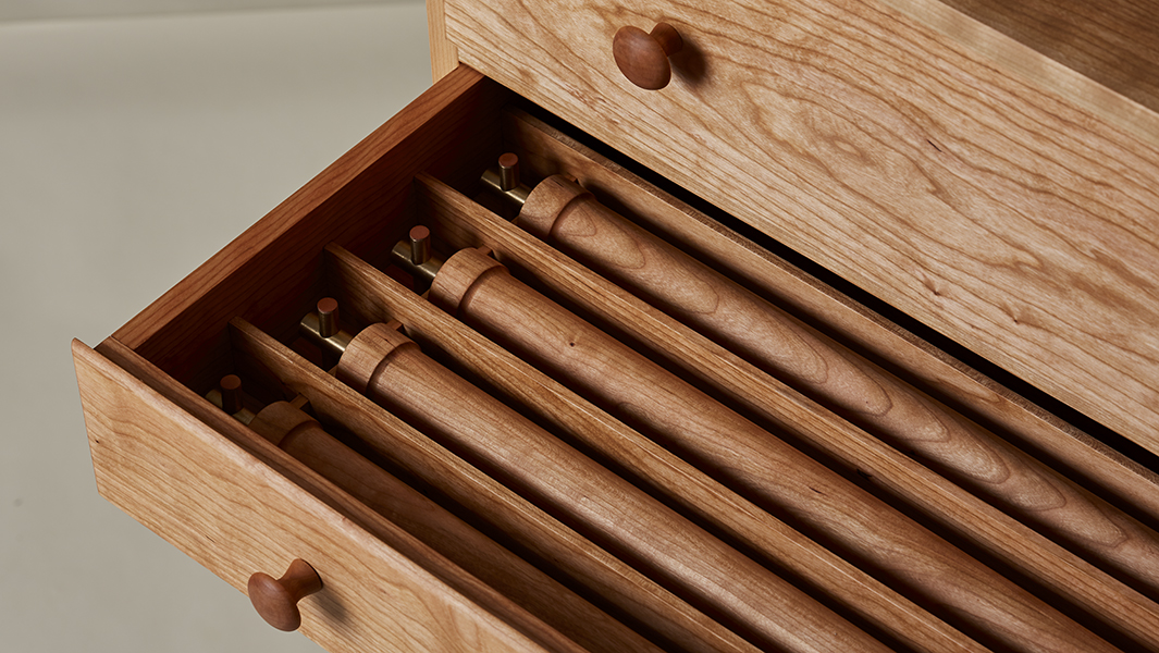
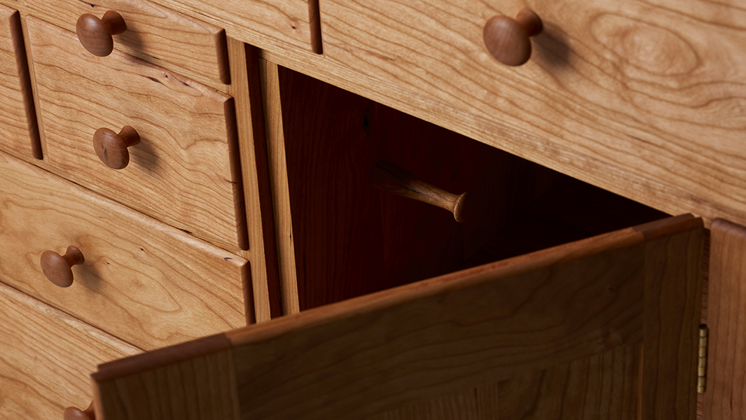
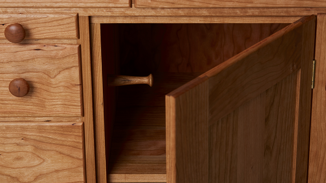
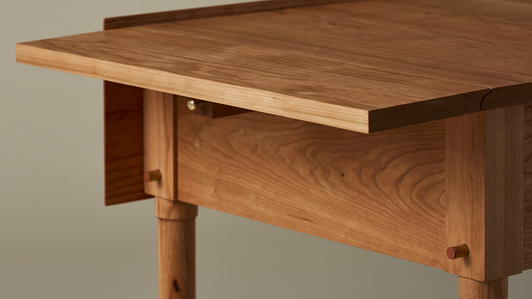
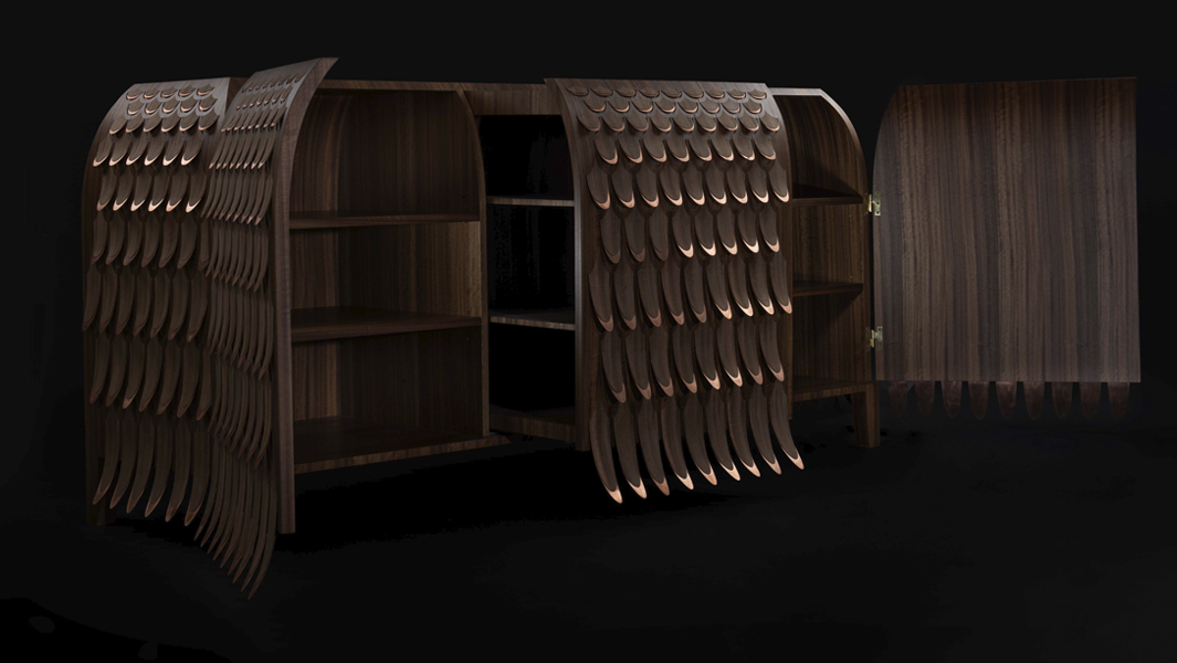
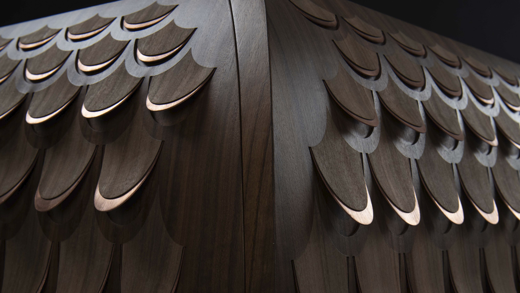
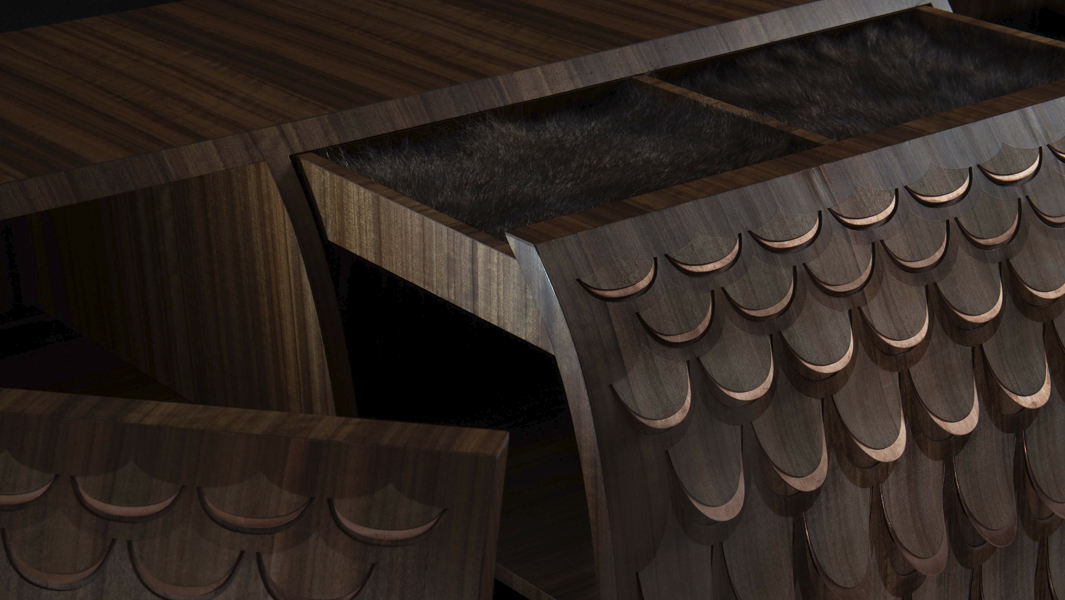
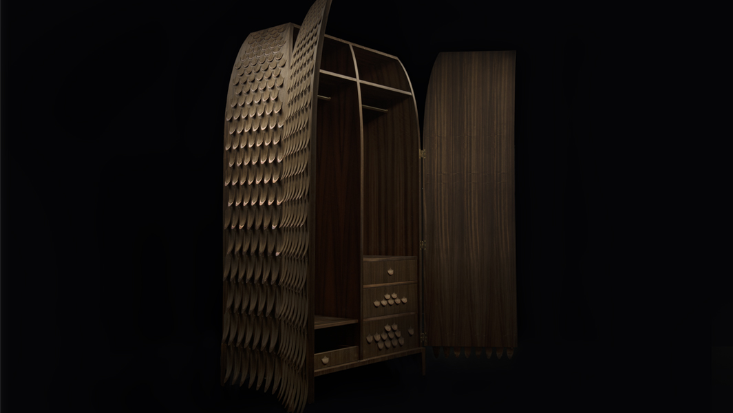
Melvin Josy and Bolaji Teniola – This unusual knitting table, that won first prize in a 1962 Norwegian Design Competition, has survived well but worn over the decades. Furniture designers Melvin Josy and Bolaji Teniola bring it into the contemporary with new marquetry and wood-stitching that reflects the table’s function. Owned by Amanda.
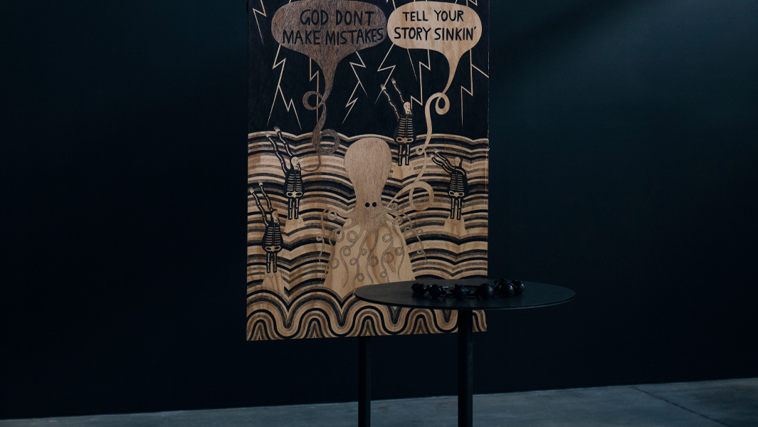
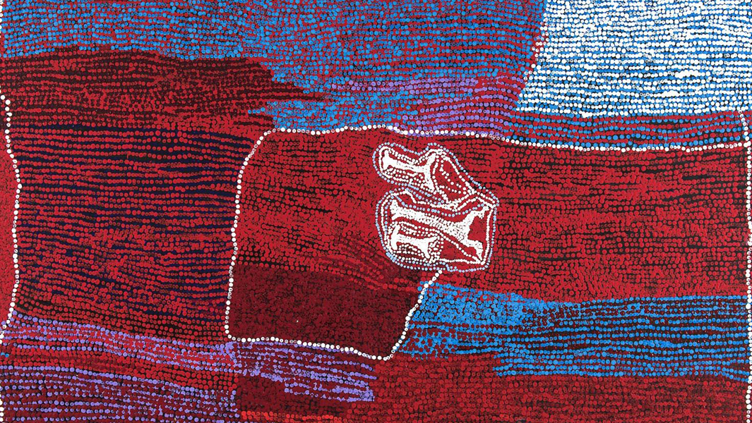
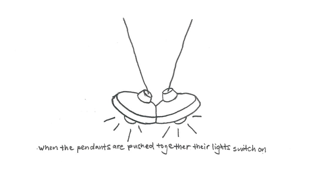
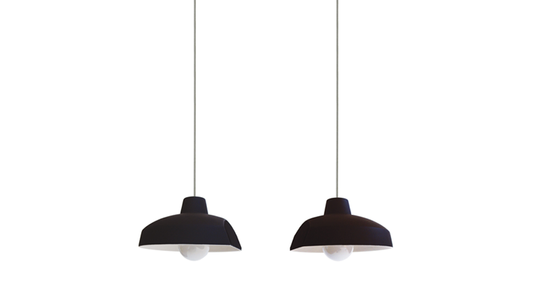
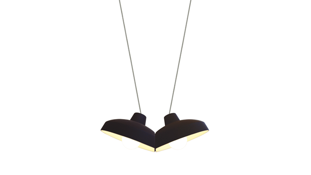
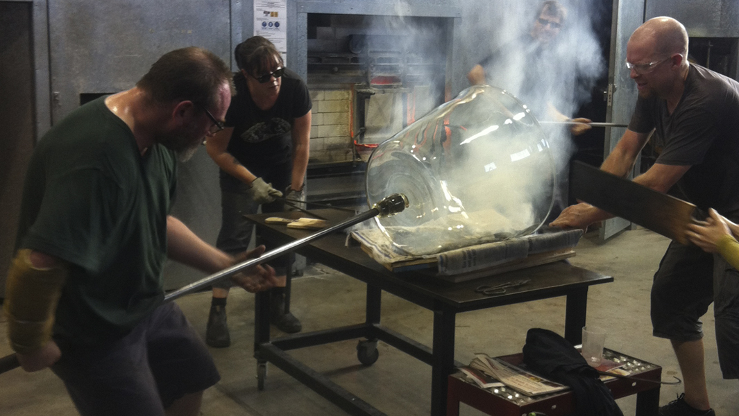
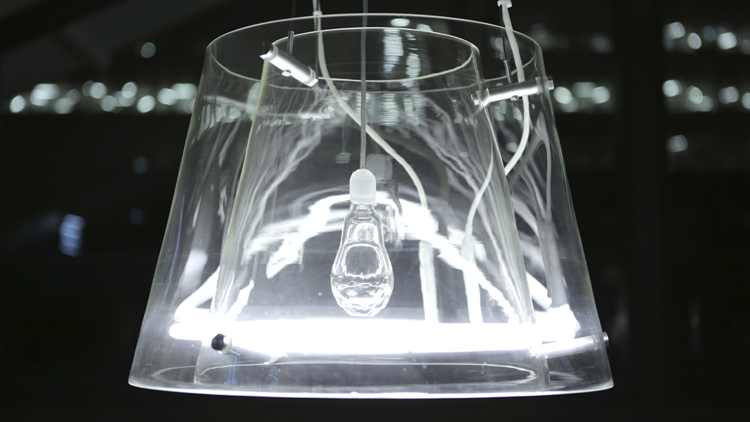
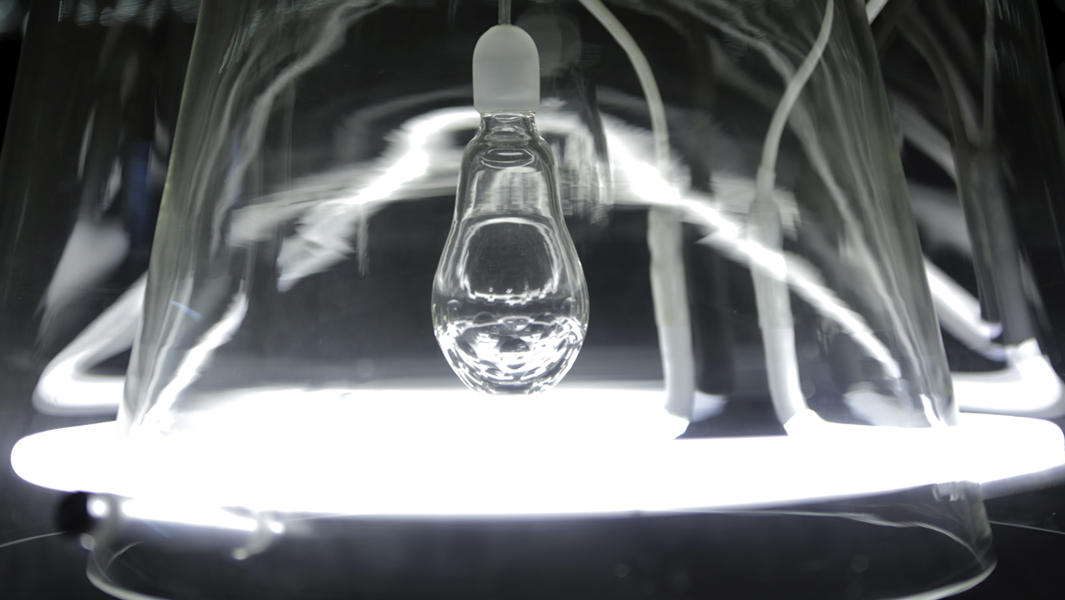
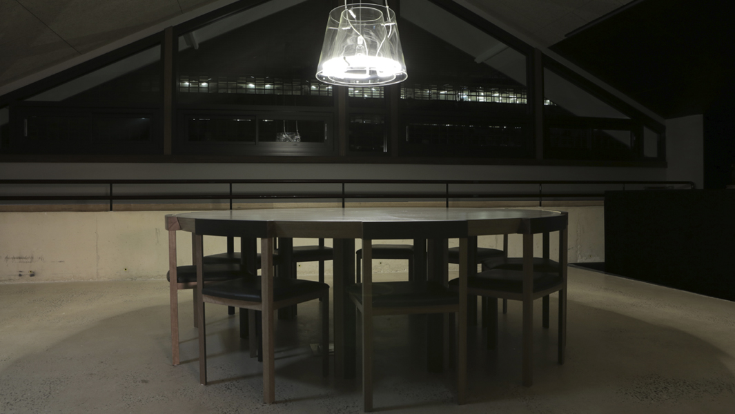
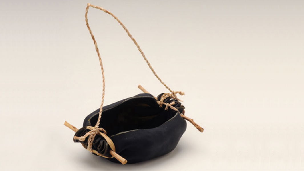
Carly Tarkari Dodd – Kaurna, Narungga and Ngarrindjeri artist Carly Tarkari Dodd transforms the textile from a broken Enoki Cumulus light using Ngarrindjeri weaving techniques. Owned by Enoki.
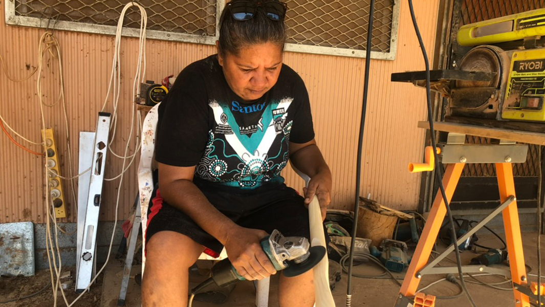
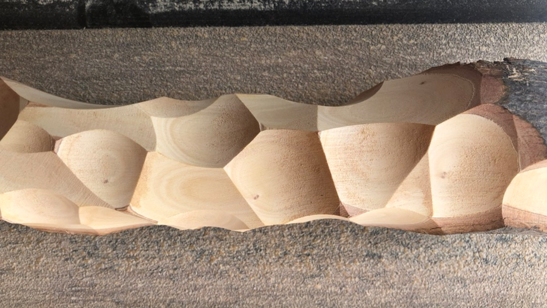
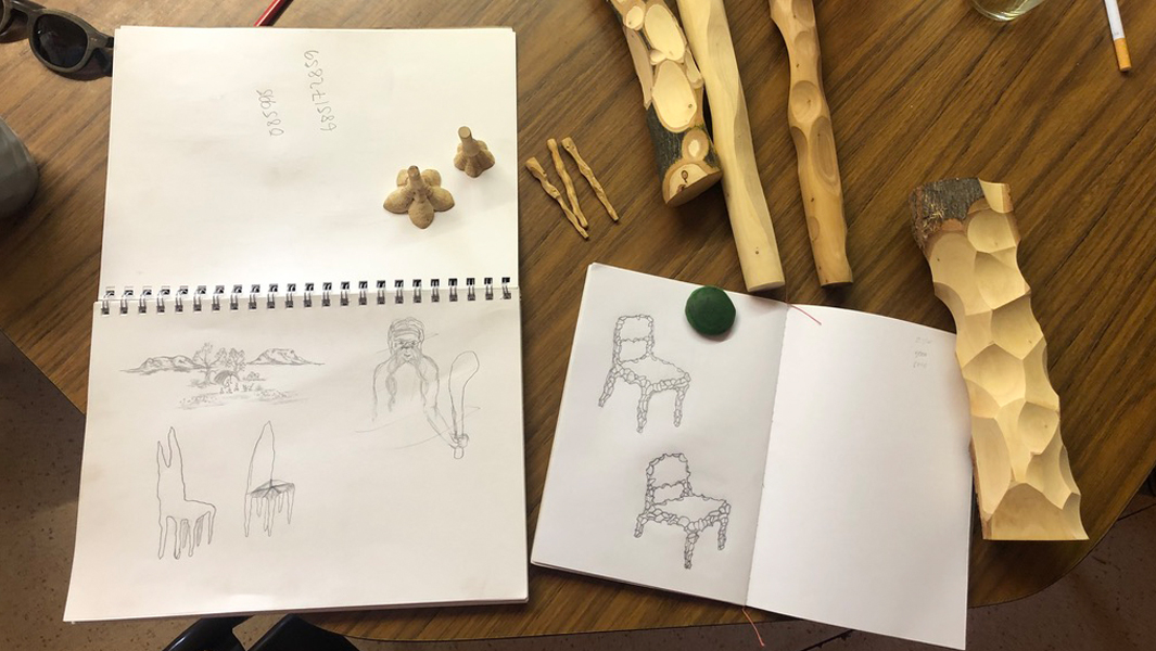
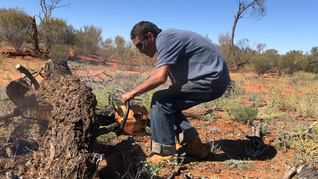
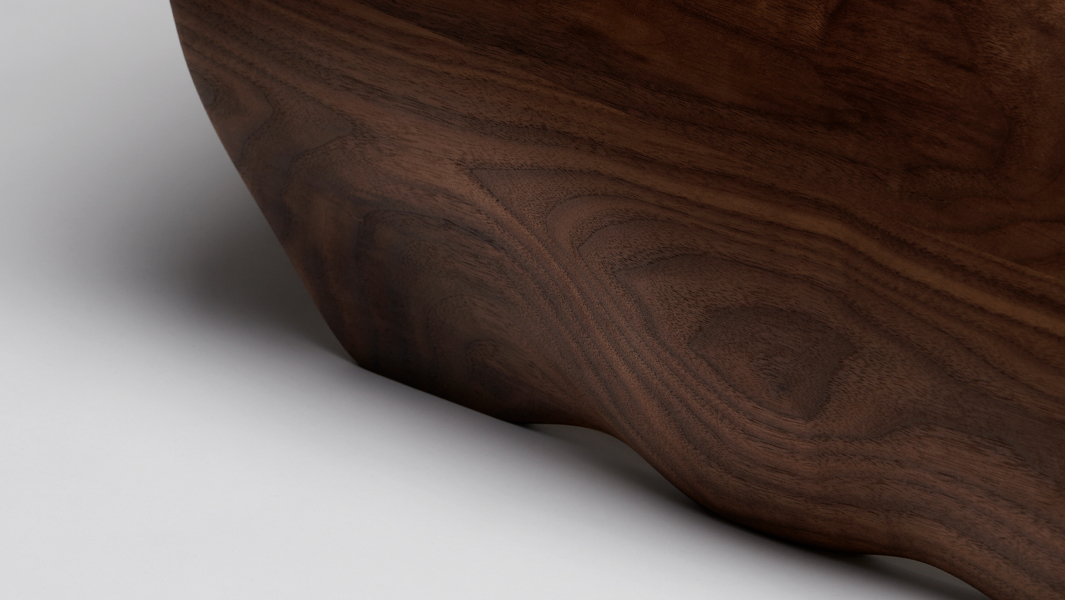
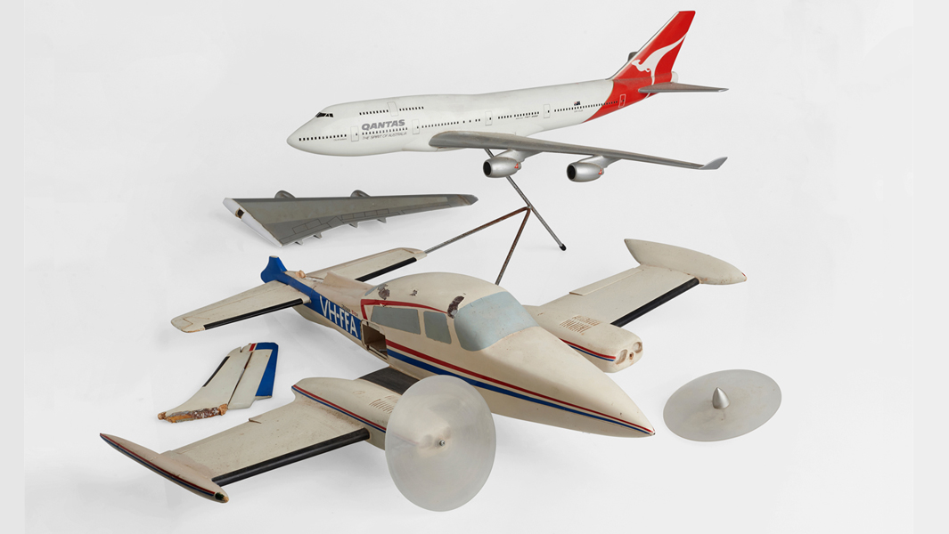
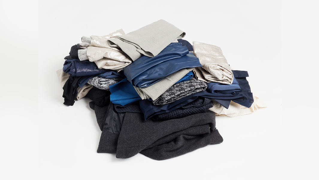
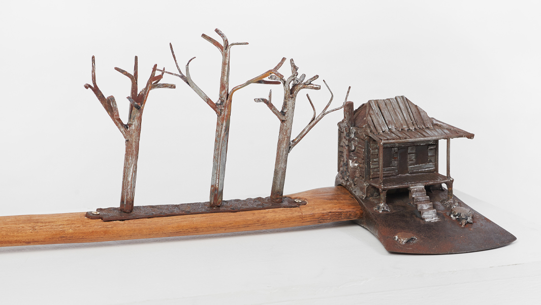
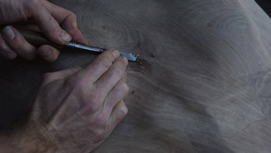
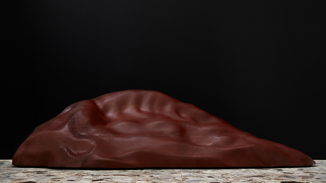
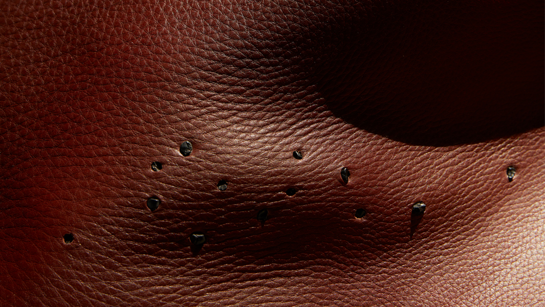
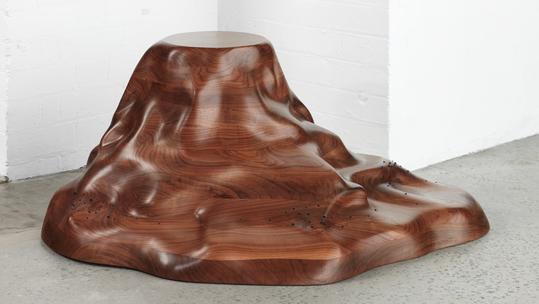
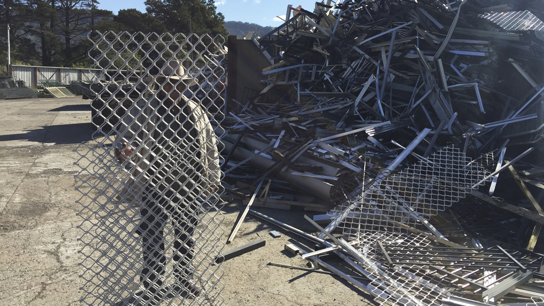
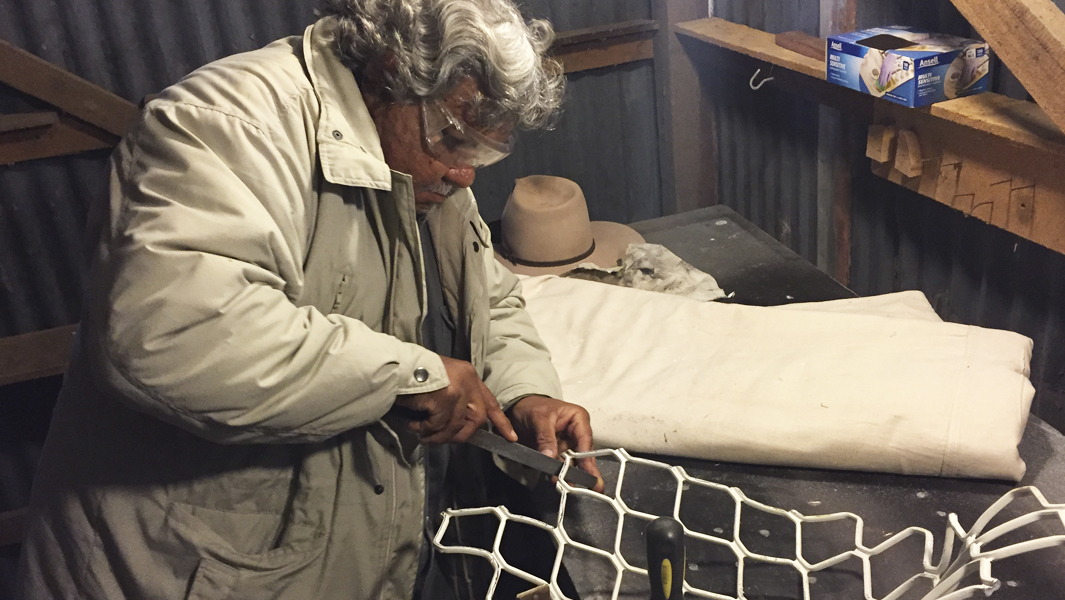
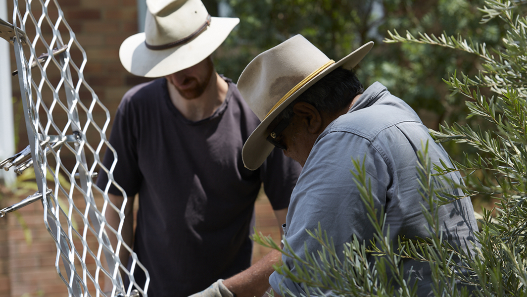
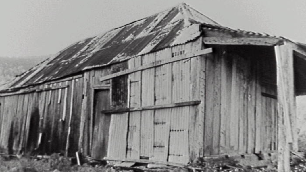
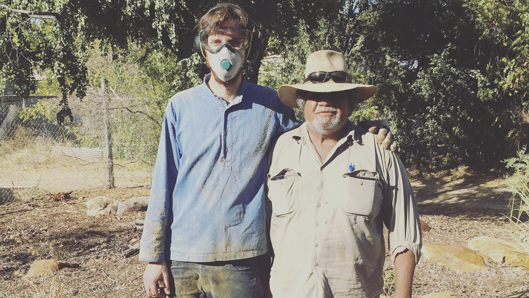
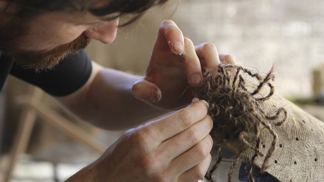
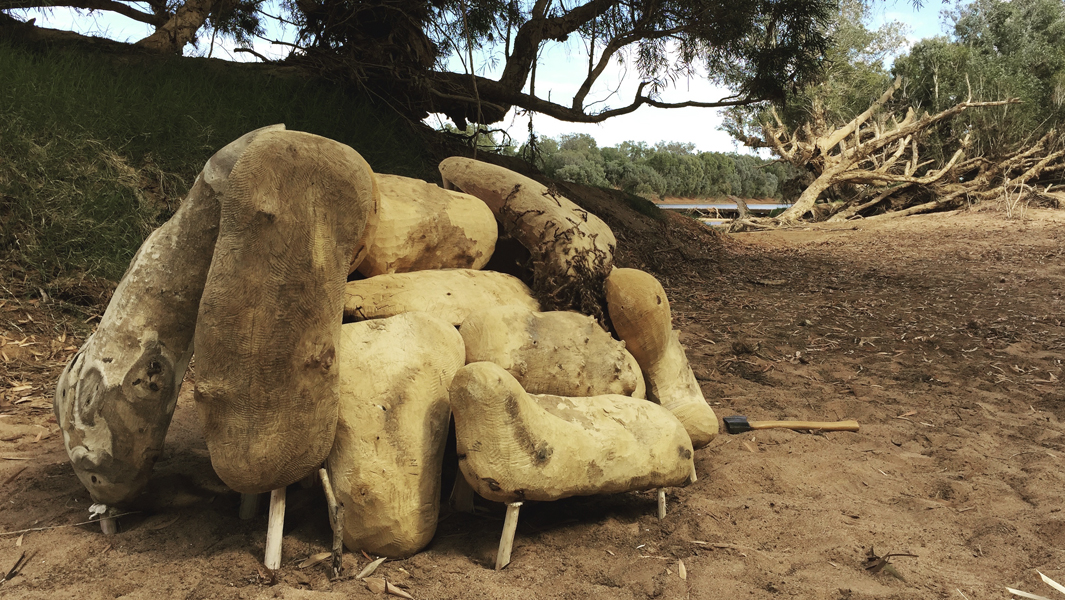
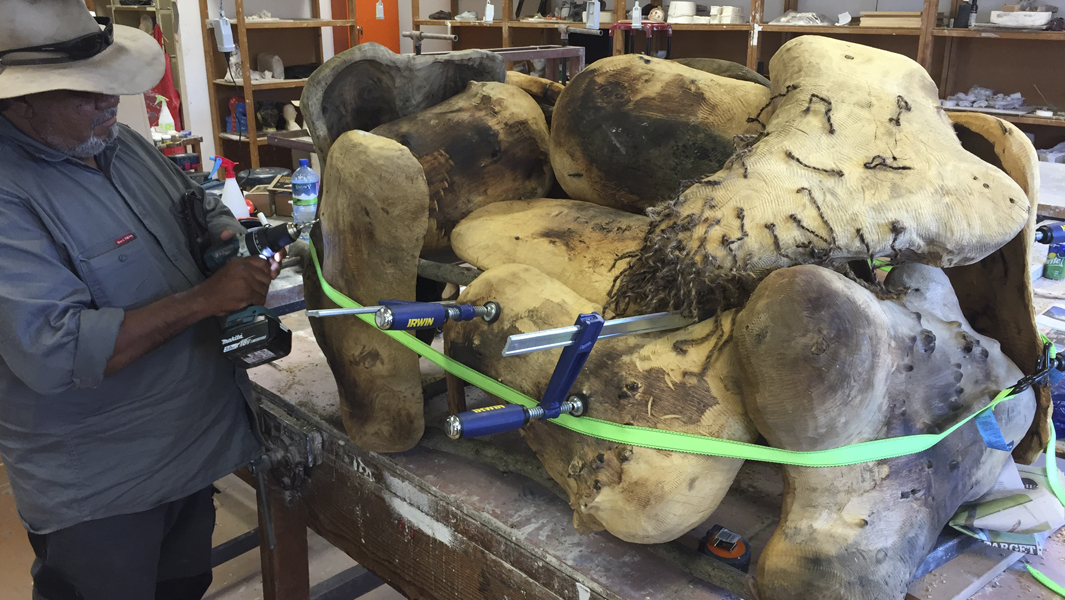
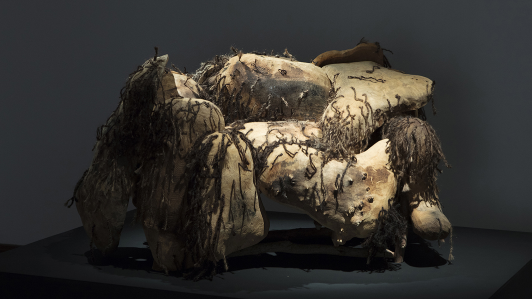
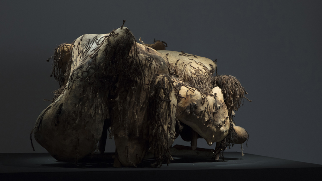
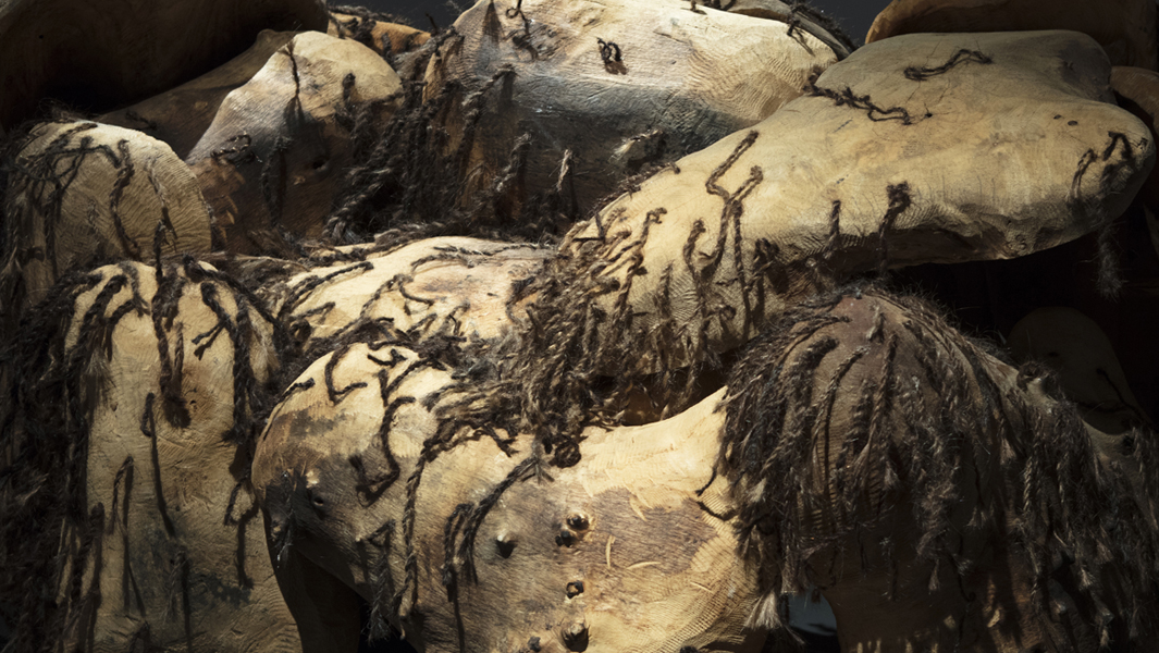
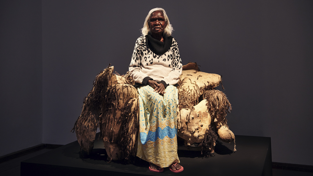
Xanthe Murphy and Jordan Leeflang – The first lot of transformations of stuff from a shed. Designers Xanthe Murphy and Jordan Leeflang deploy timber from a branch, fallen from a favourite tree, in the deisgned reuse of furniture and homewares.
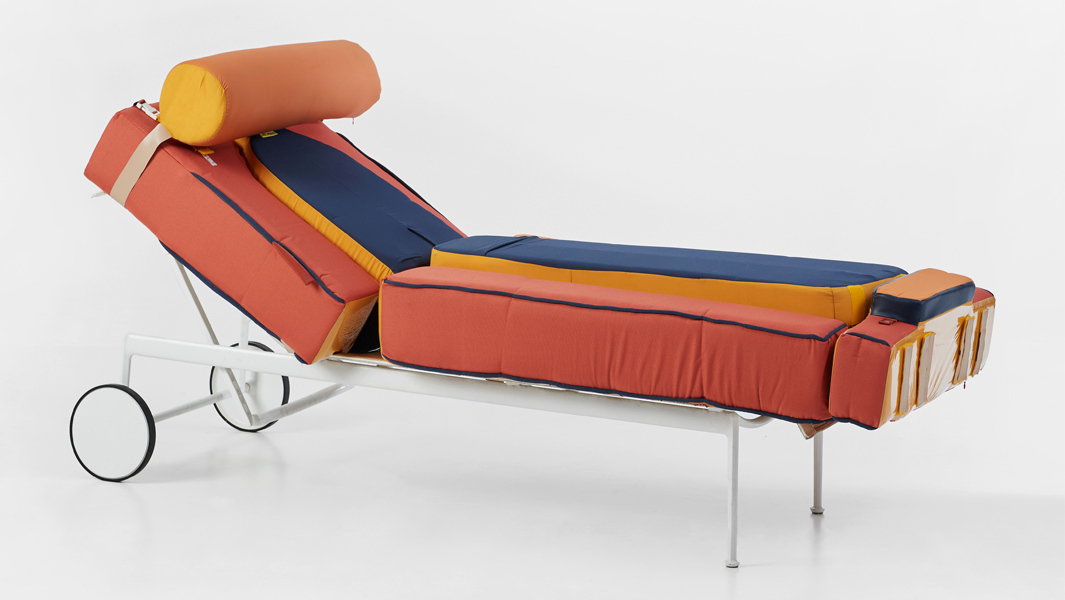
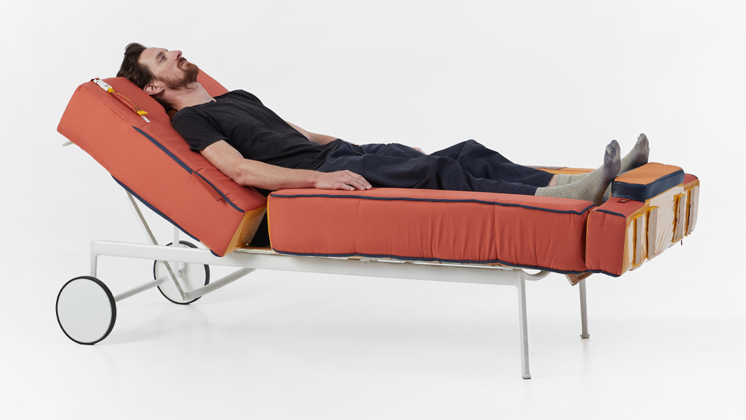
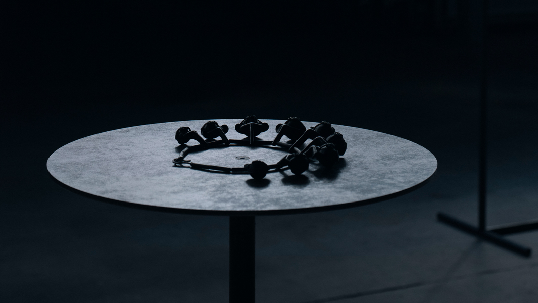
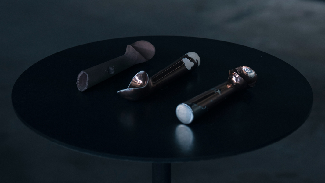
The second lot of transformations of stuff from a shed. Jeweller Courtney Jackson and craftsperson Steve Soeffky transform a selection of kooky objects, handpicked on a summer afternoon, into jewellery and sculpture at different scales. Owned by Stephen.
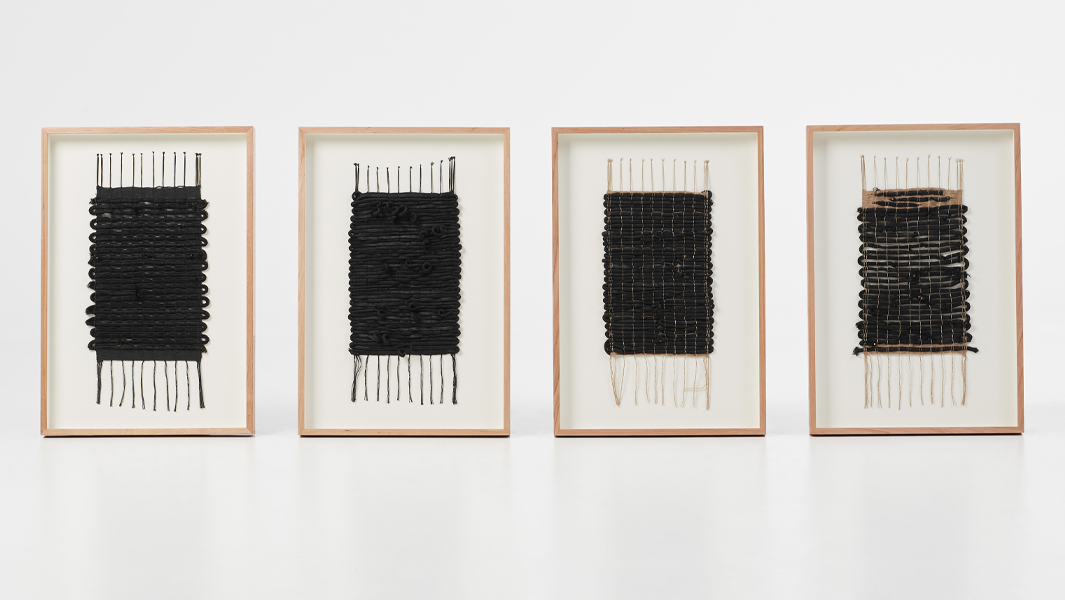
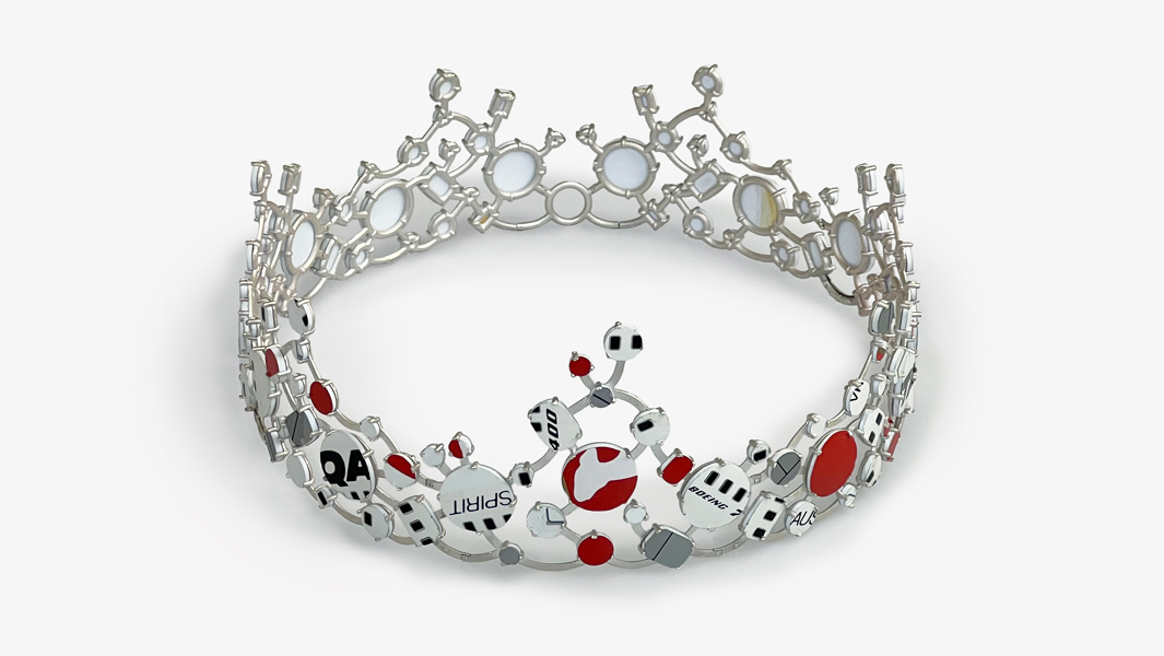
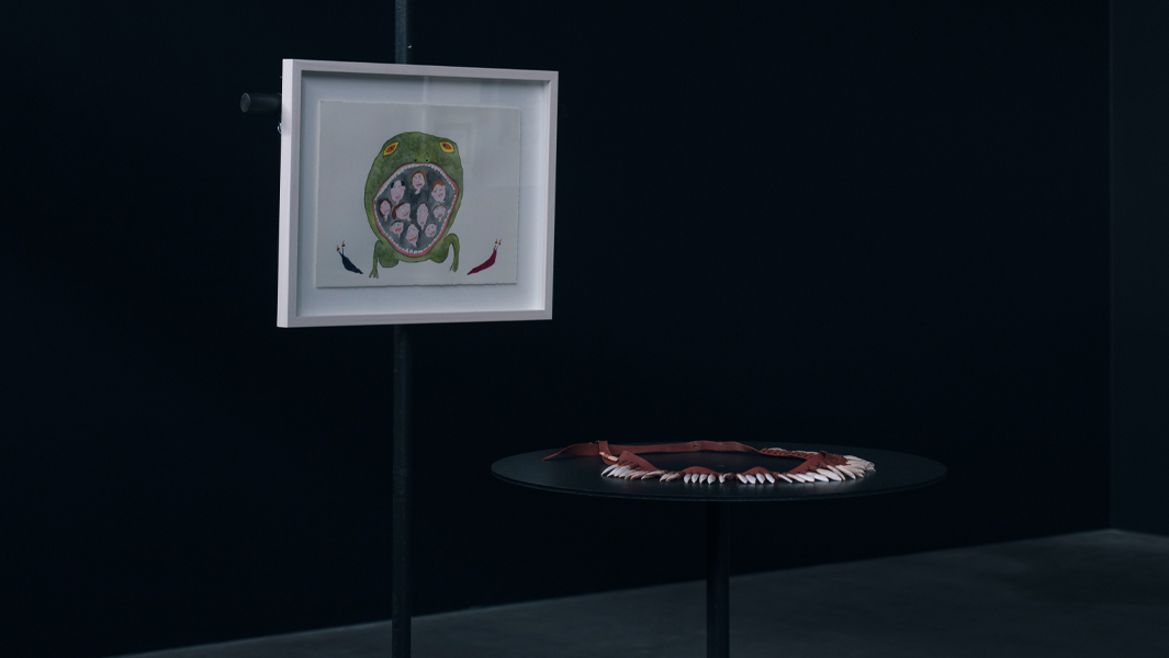
Kay Lawrence – These two Alice Potter necklaces are repaired by Kay Lawrence with the assistance of Regine Schwarzer. Lawrence, a tapestry artist, also translates the sequence and colour of the necklaces into two woven bandoliers. Owned by John and Jess.
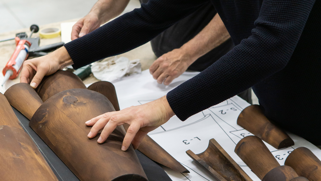
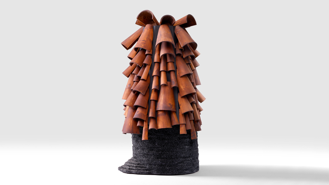
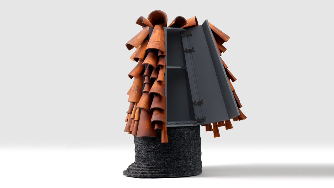
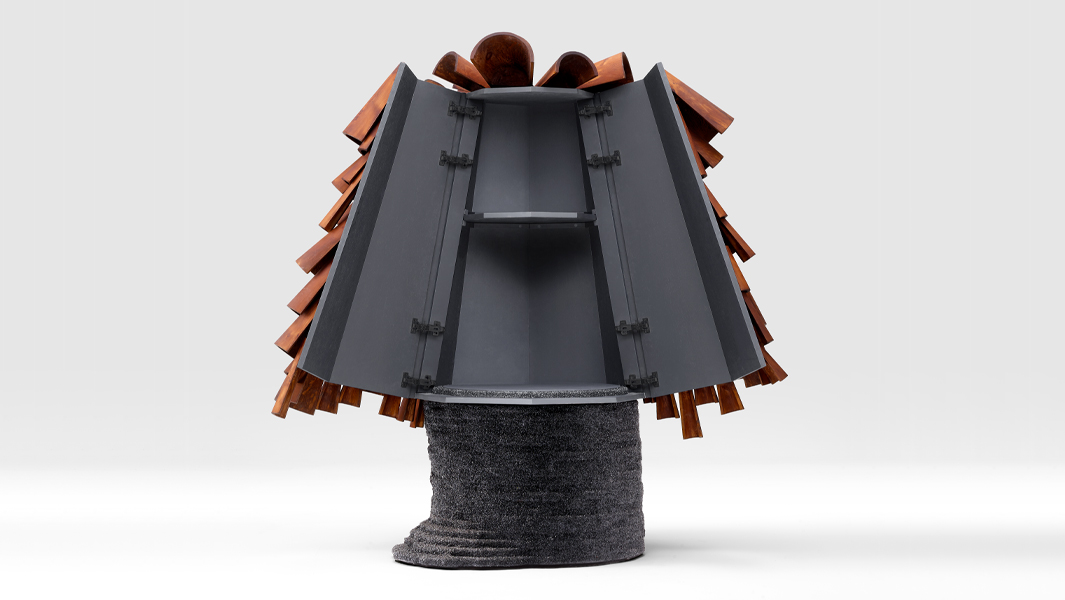
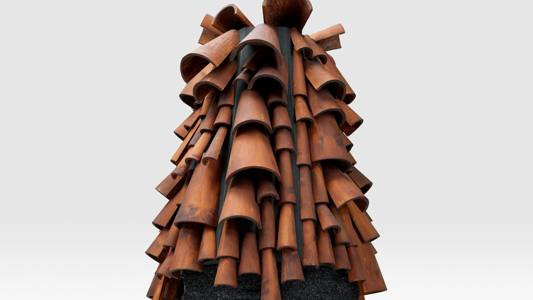
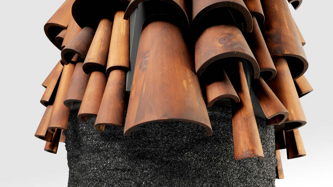
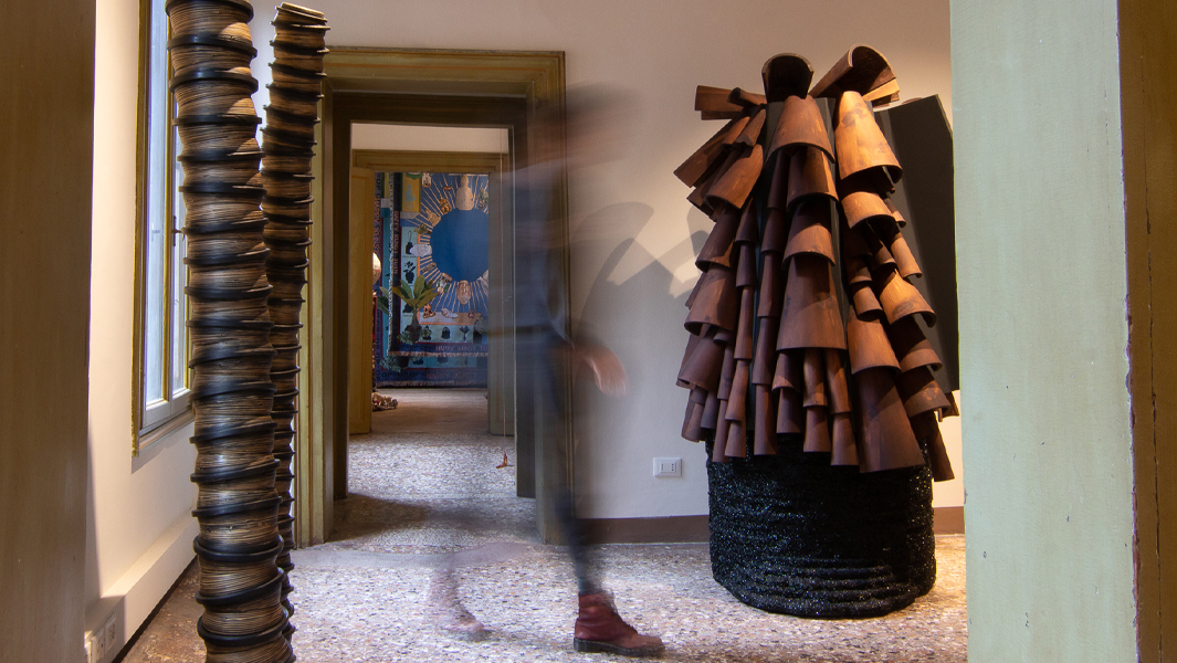
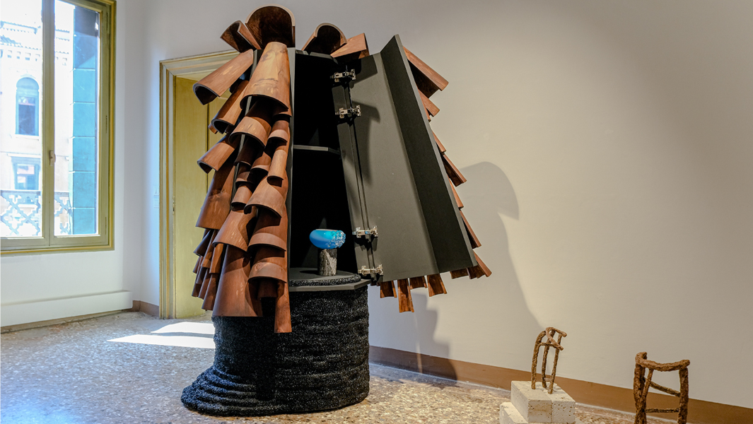
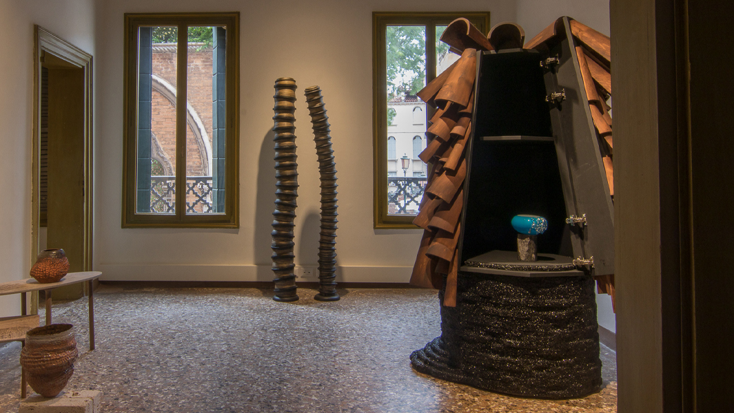
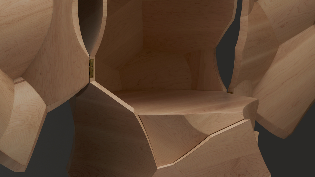
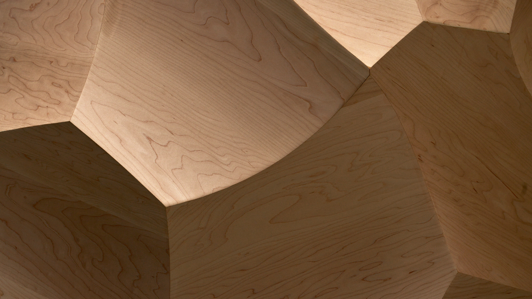
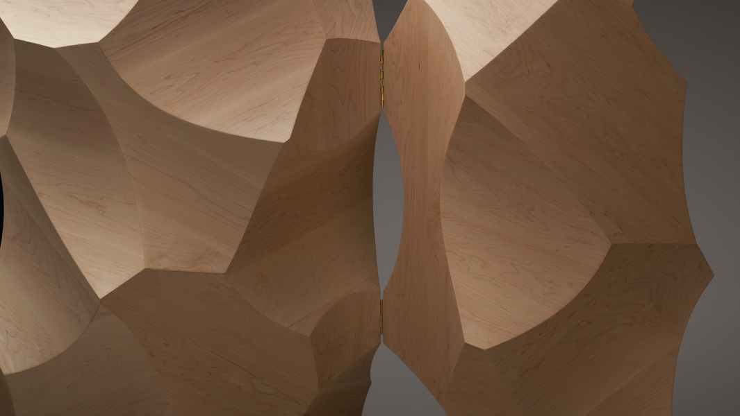
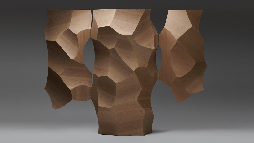
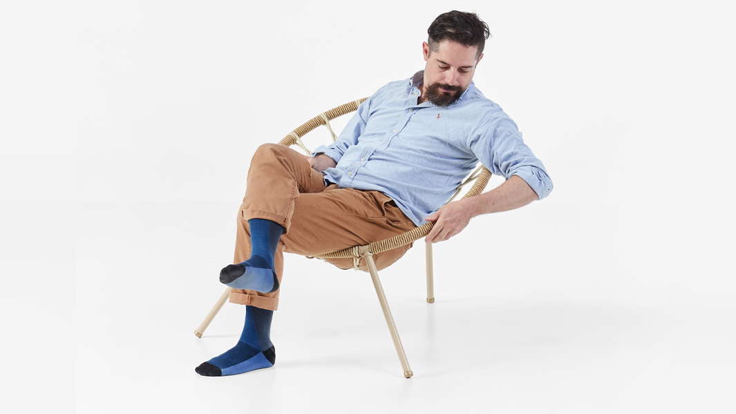
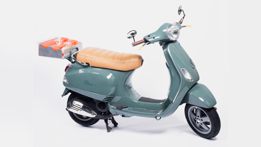
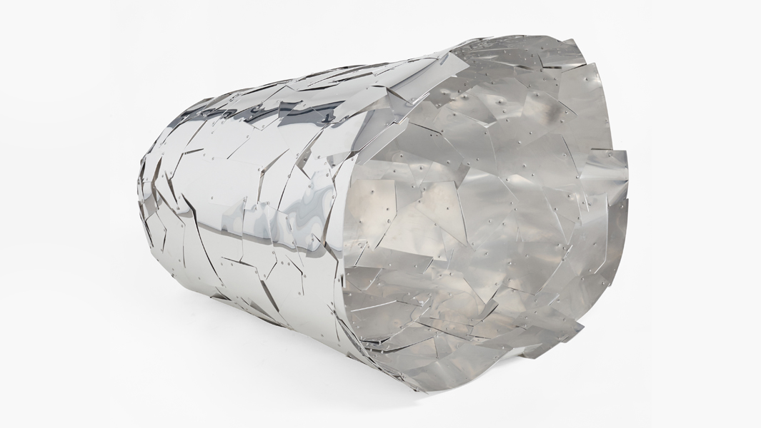
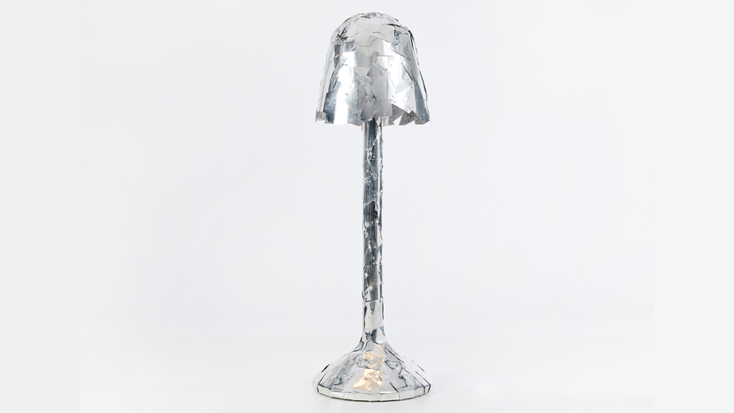
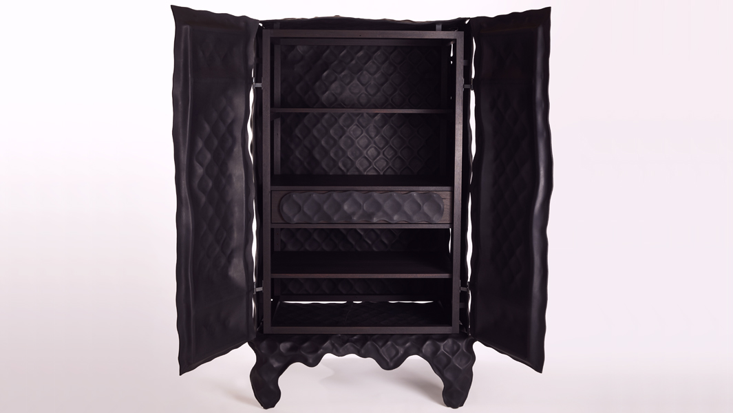
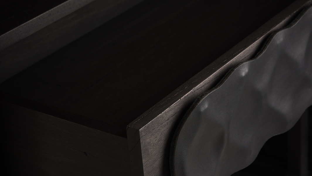
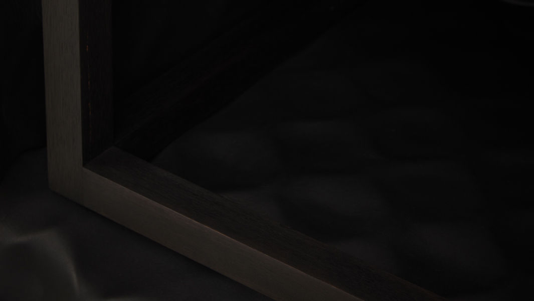
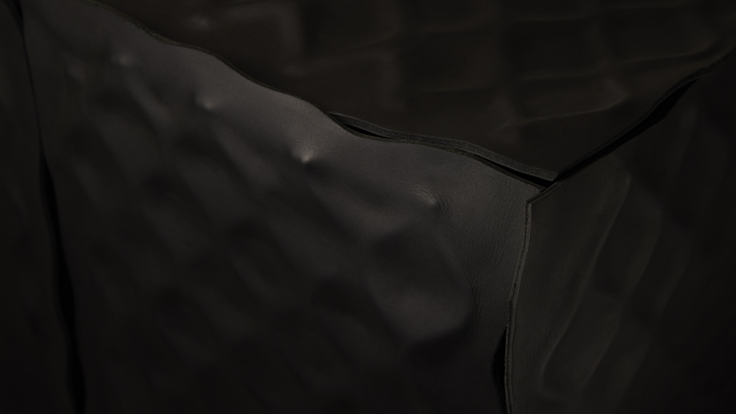
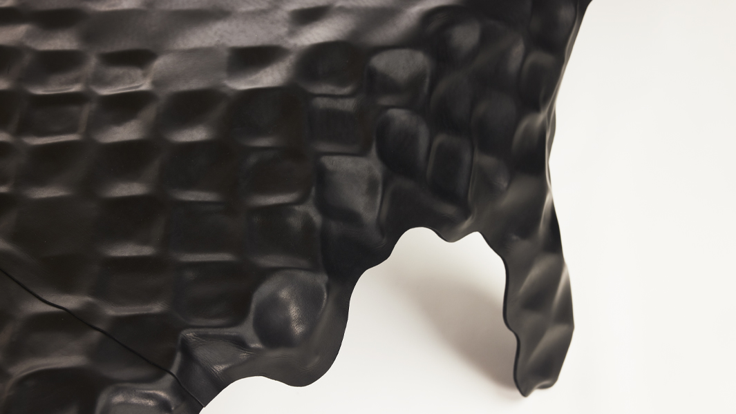
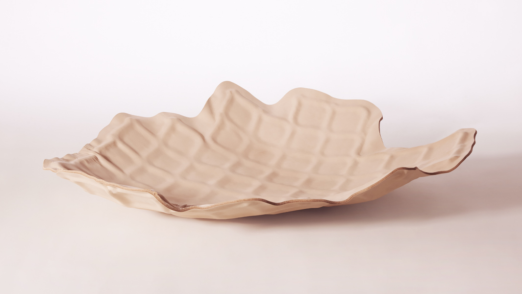
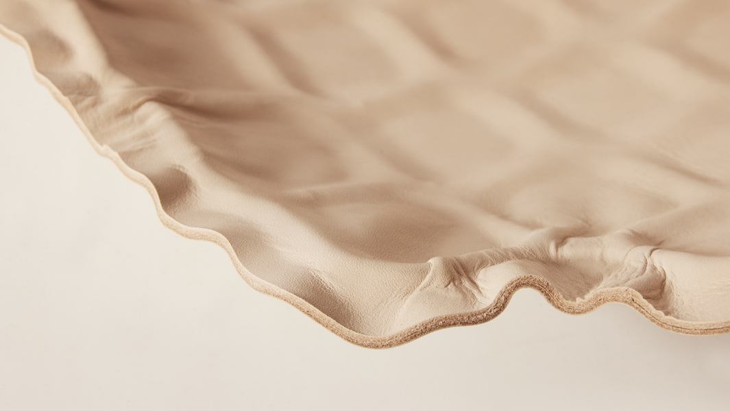
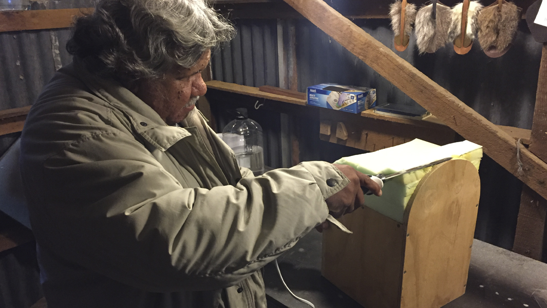
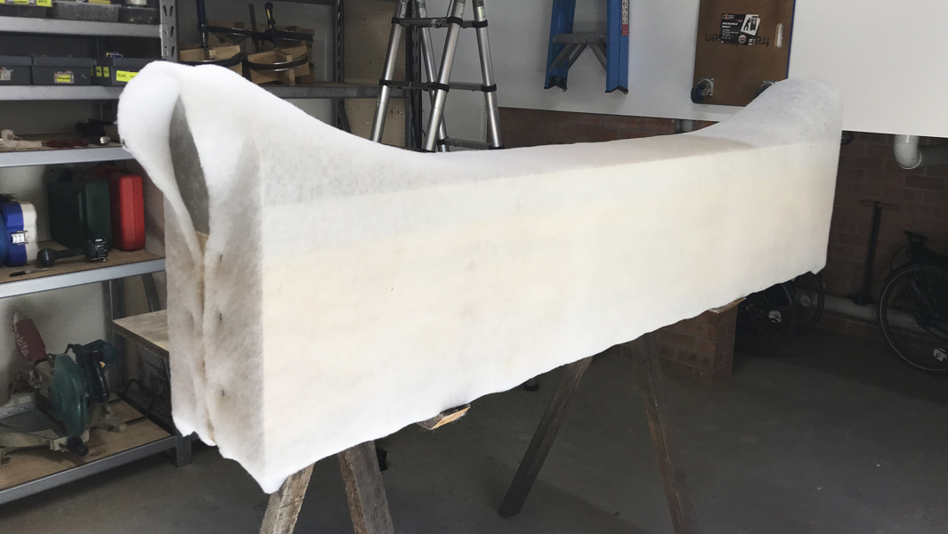
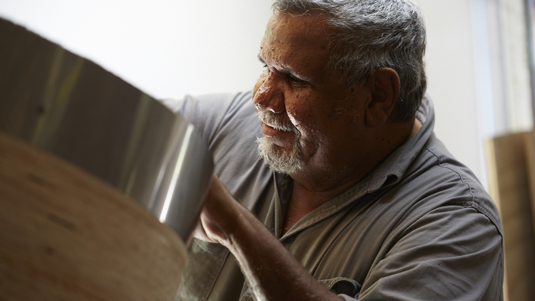
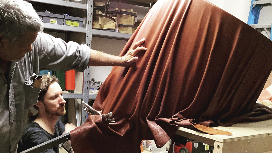
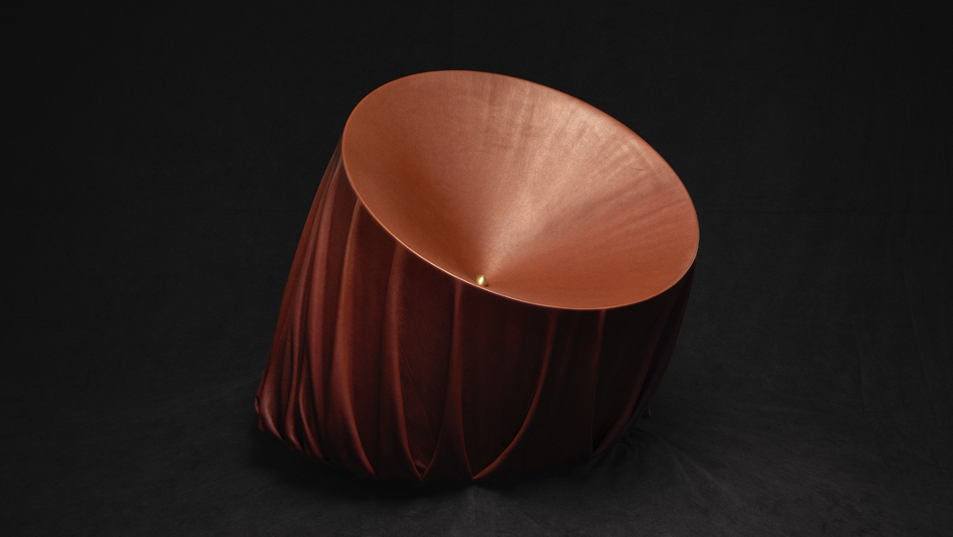
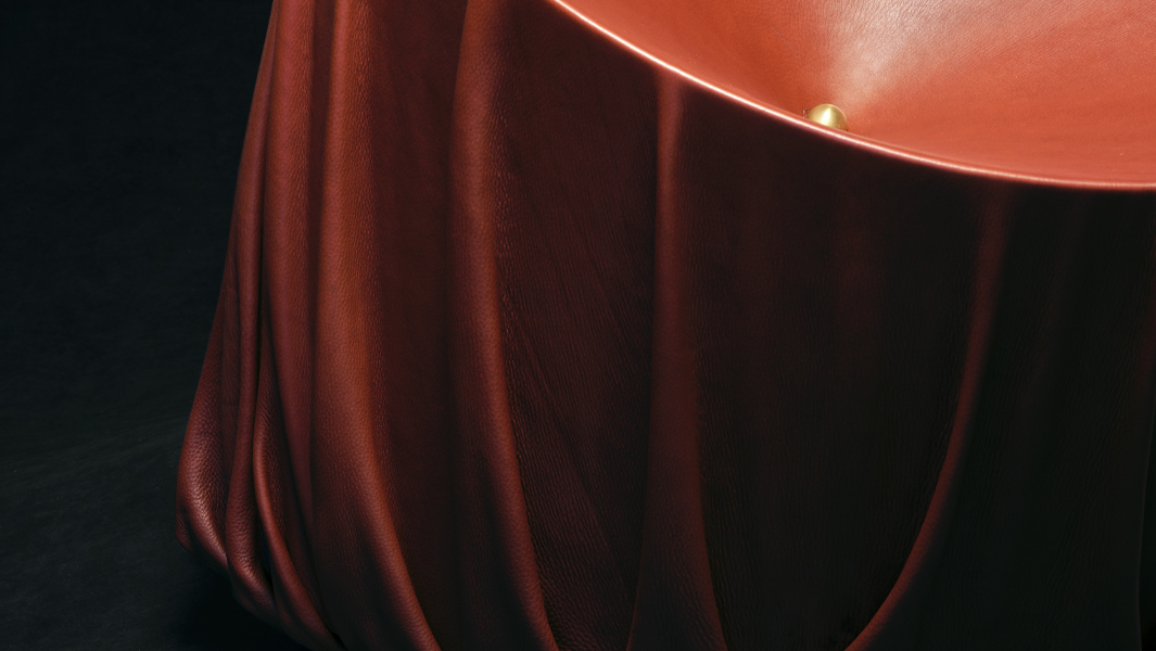
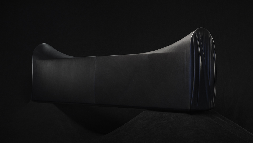
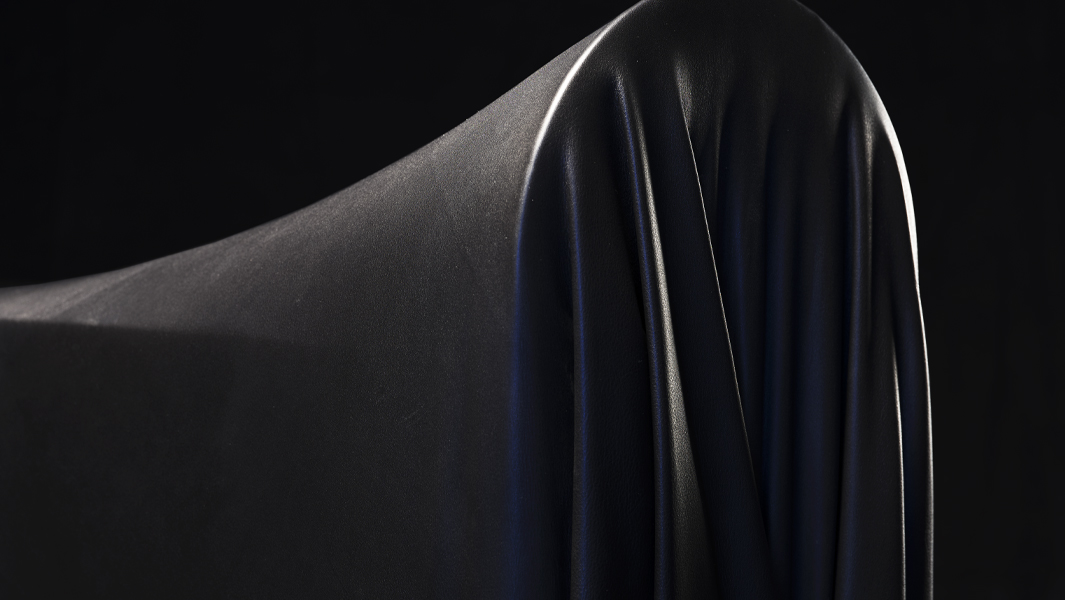
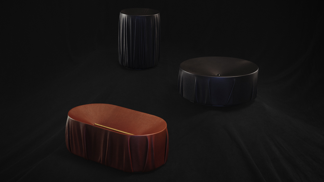
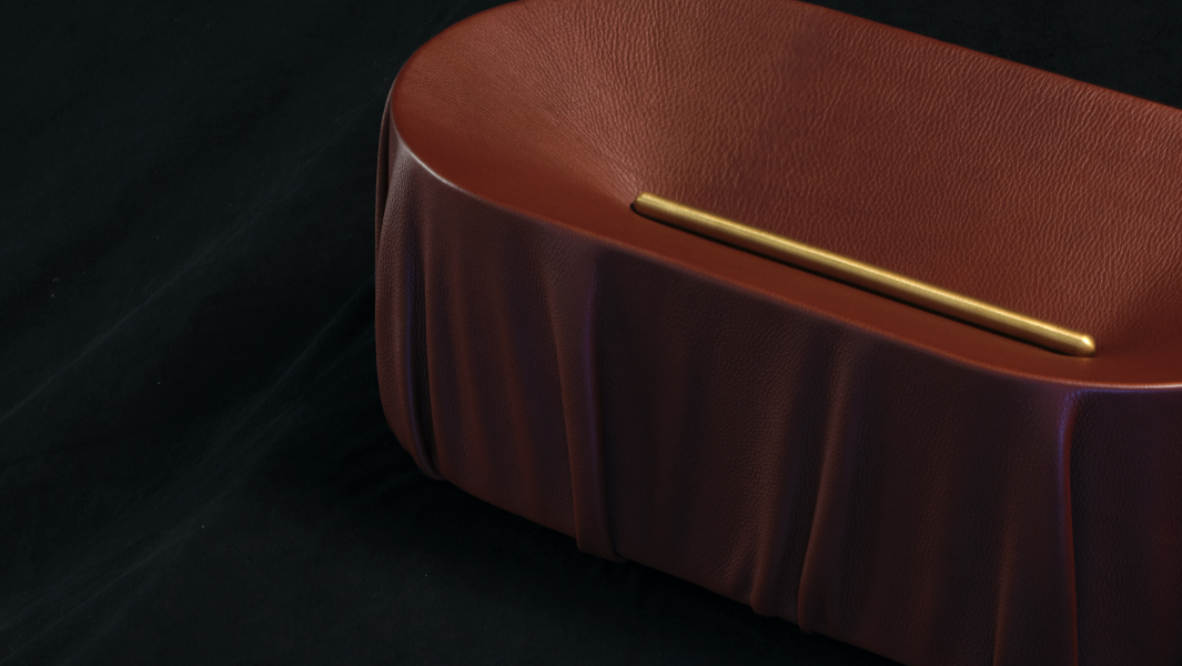
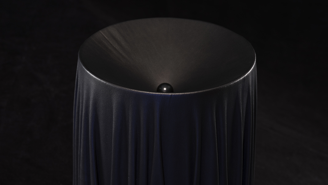
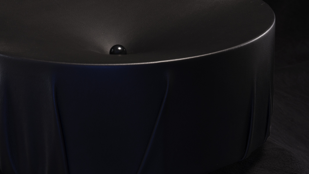
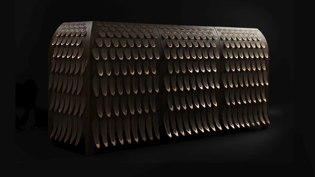
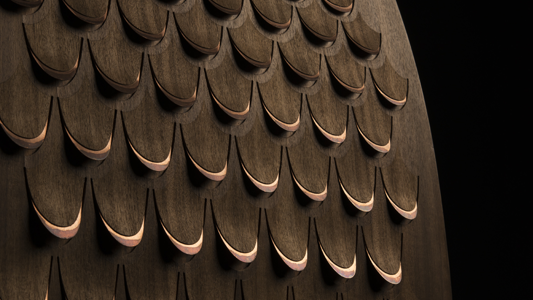
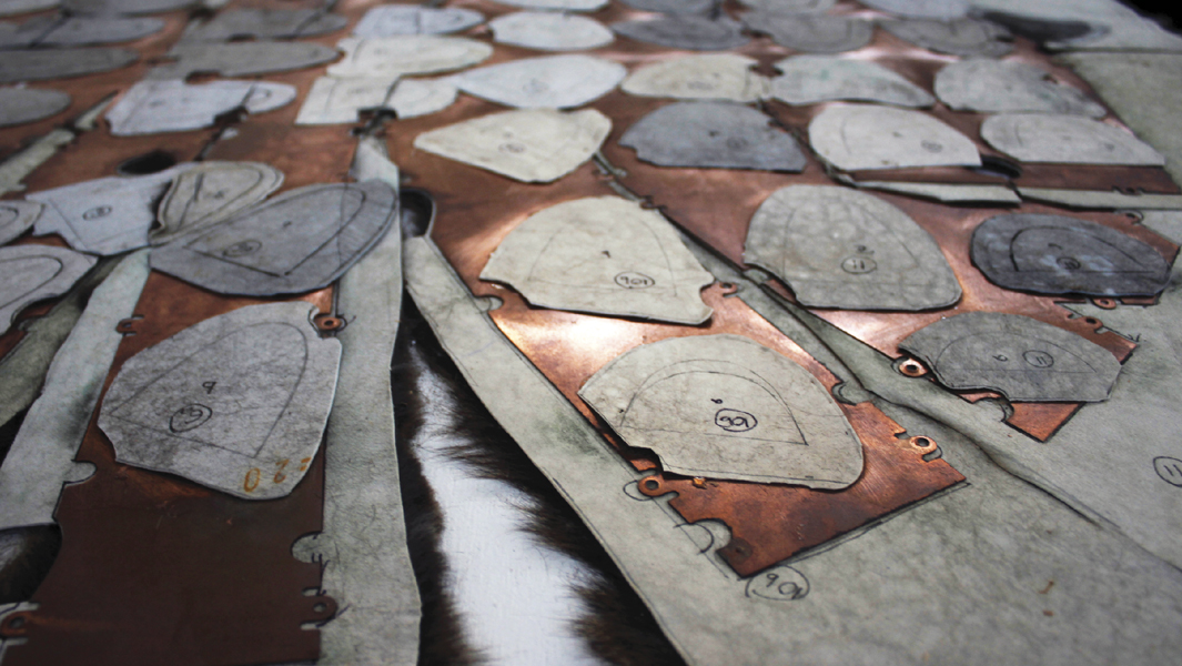
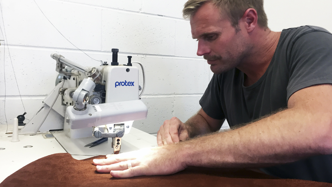
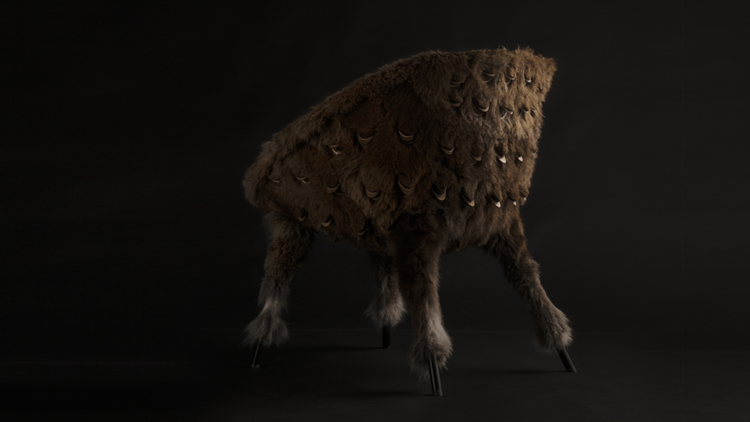
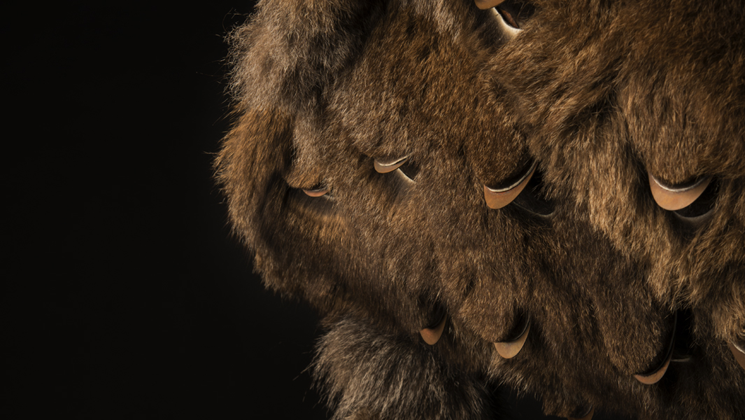
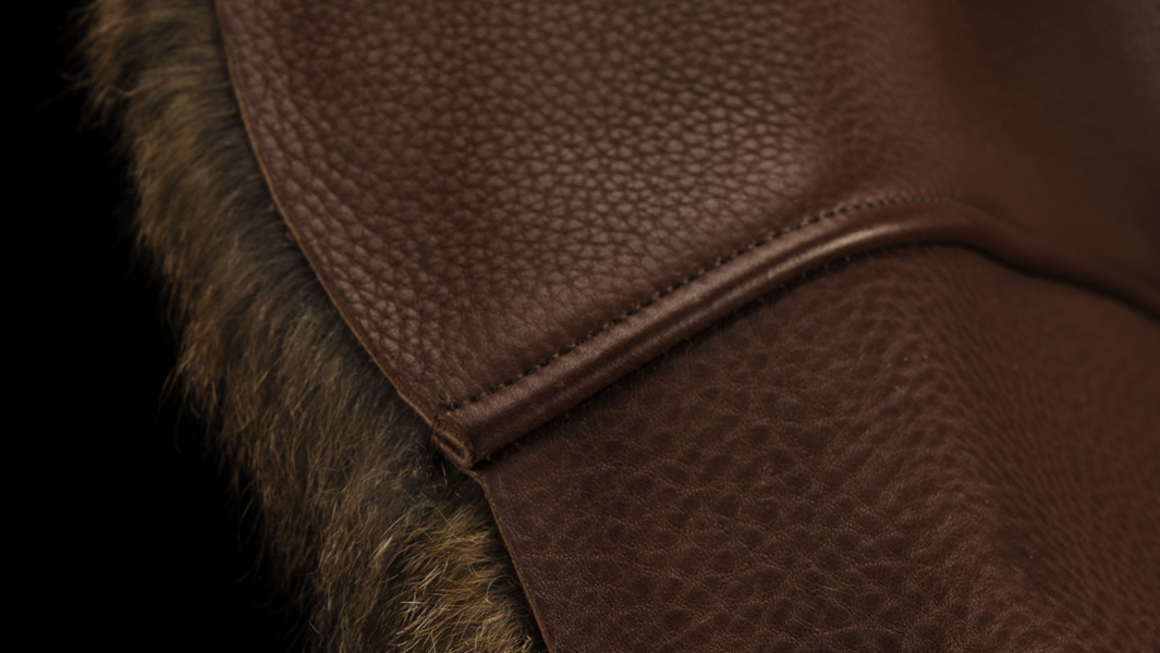
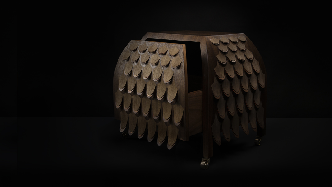
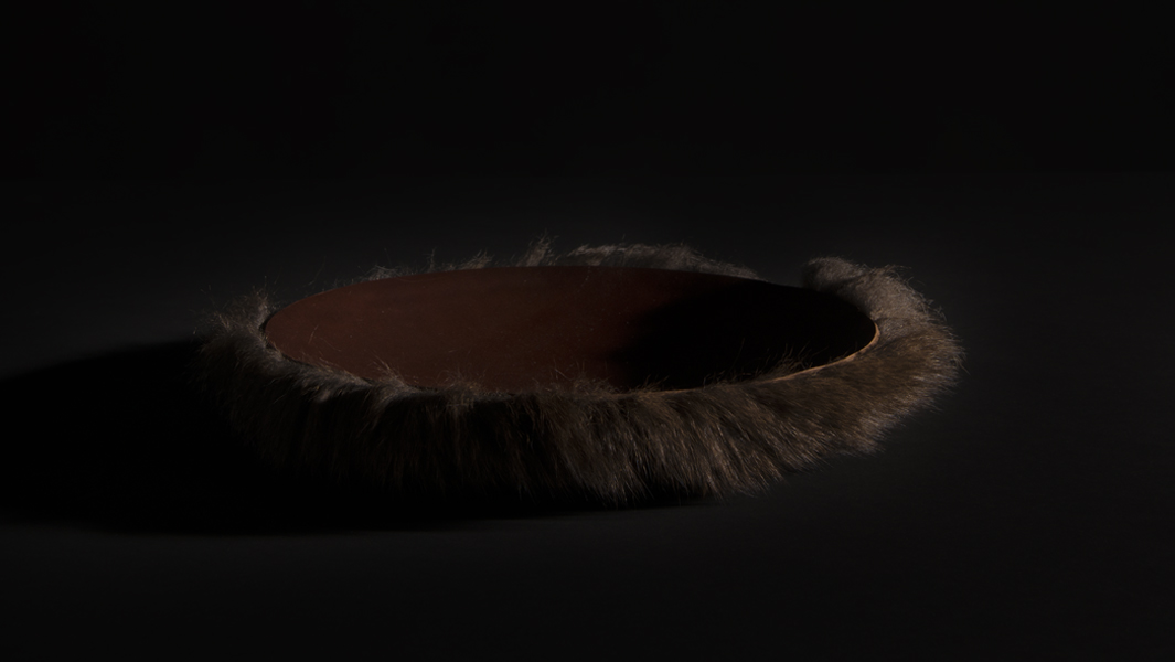
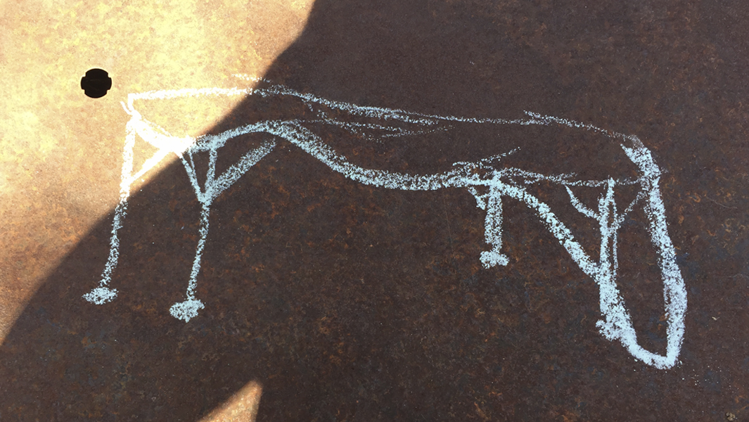
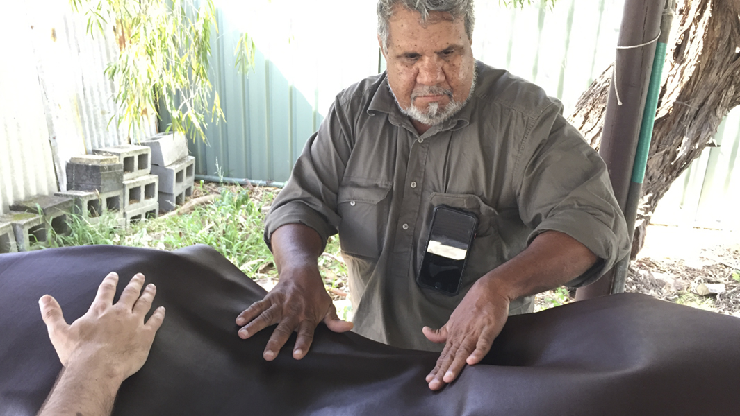
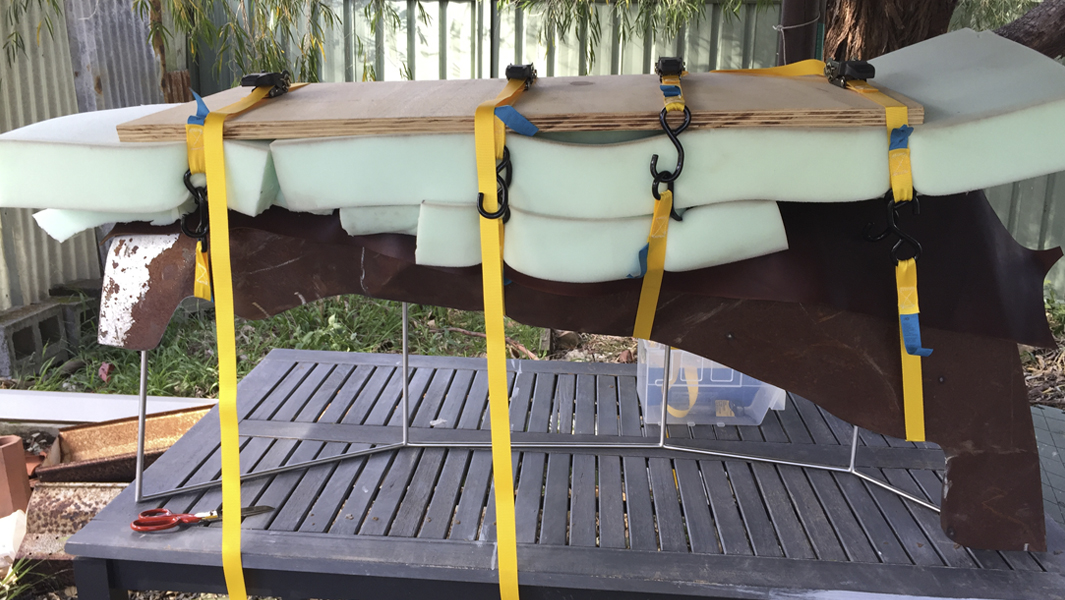
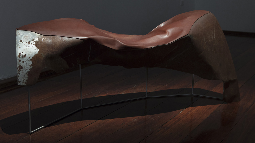
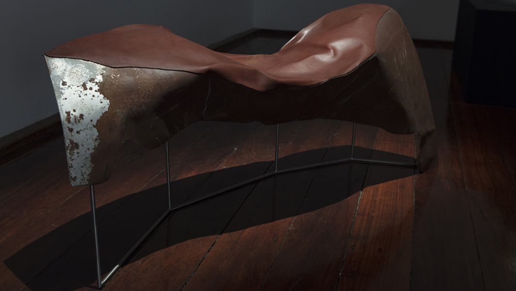
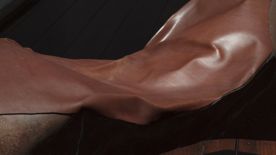
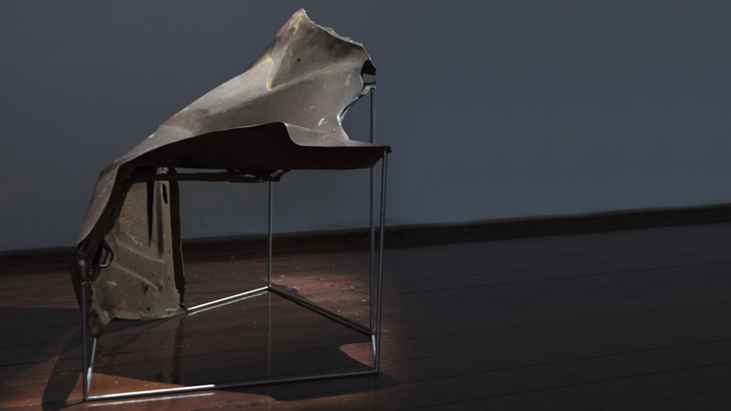
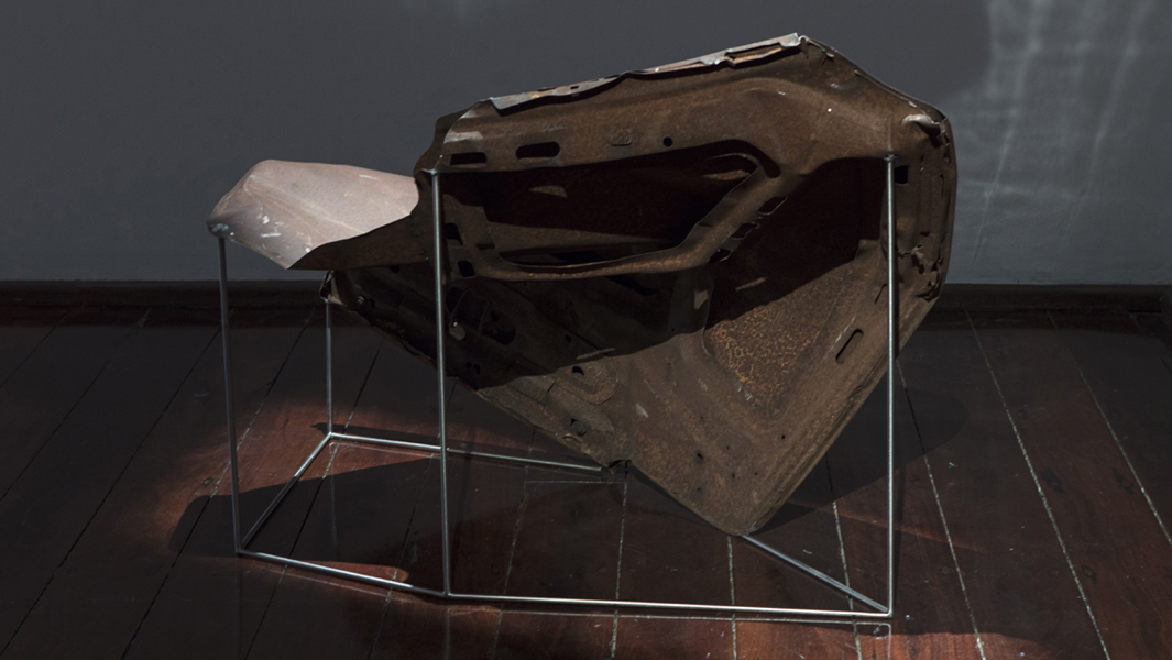
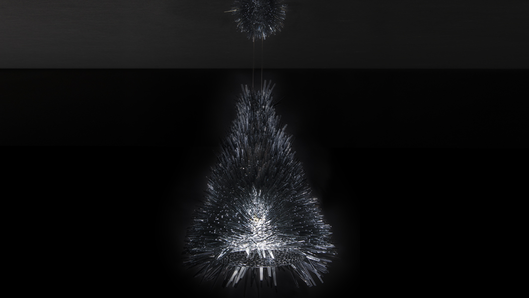
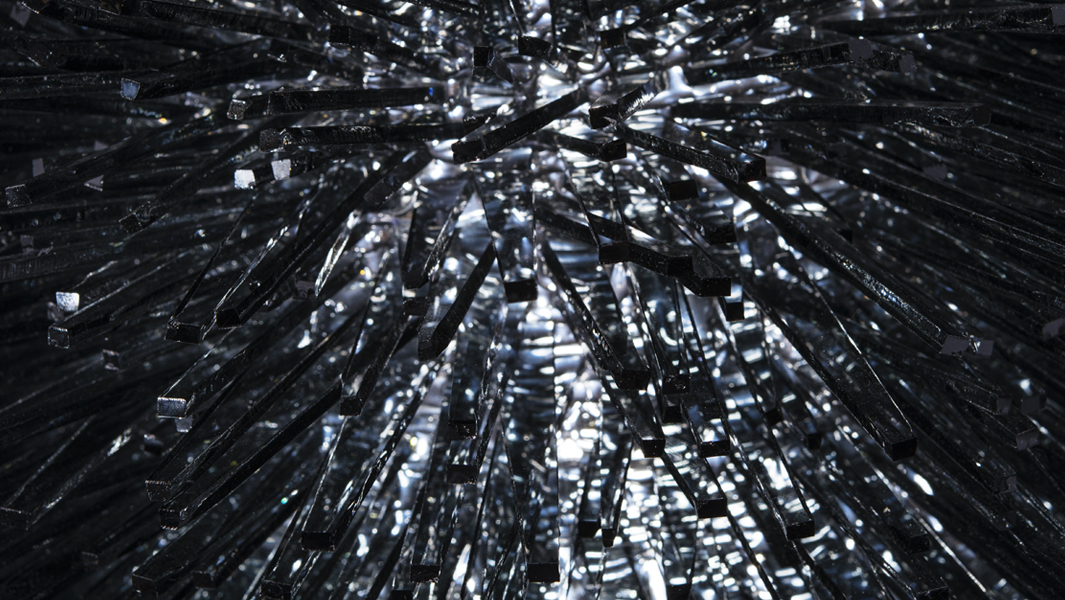
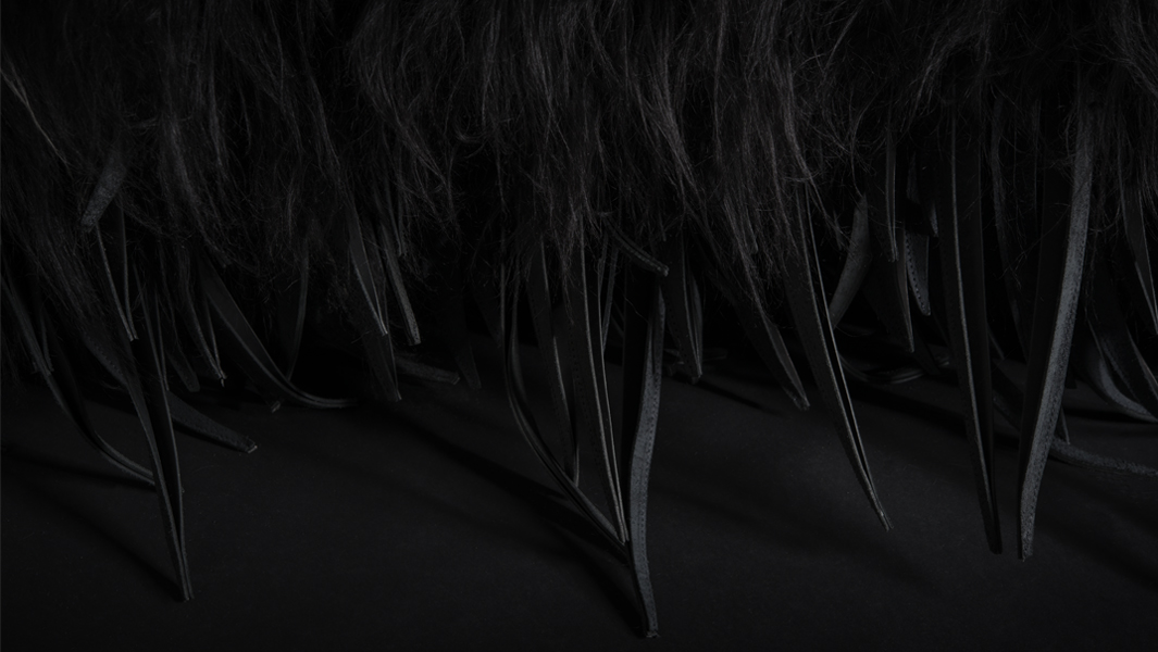
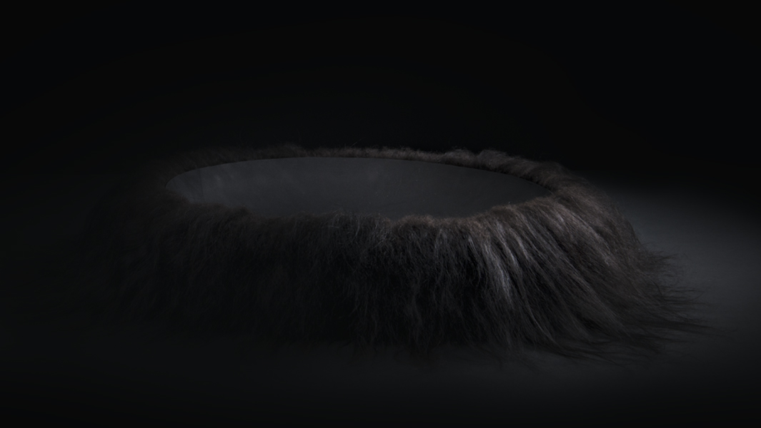
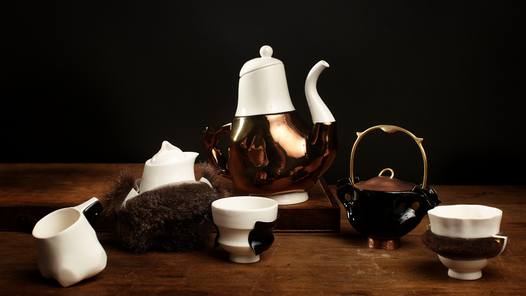
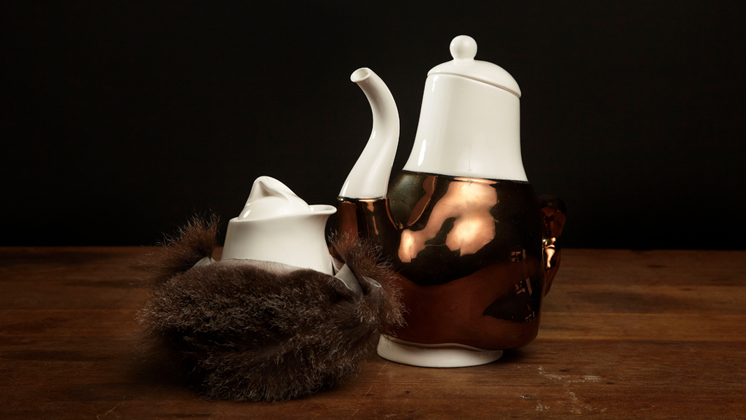
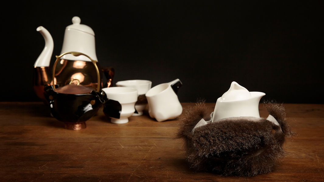
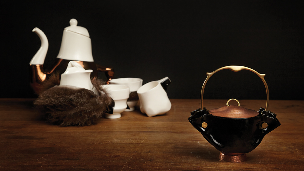
Barry Magazinovic – This one of a pair of audio speakers had sun-damaged cladding. Product designer Barry Magazinovic provides a visually dynamic repair enhancing its acoustic and thermal properties. Owned by Nigel.
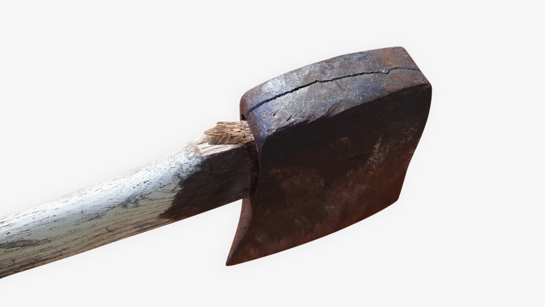
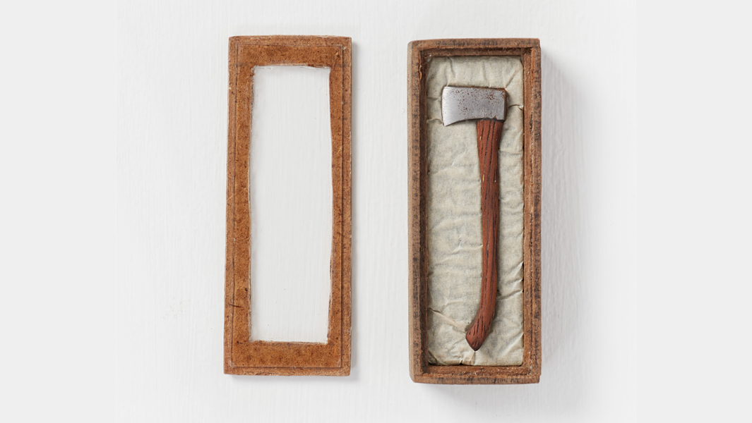
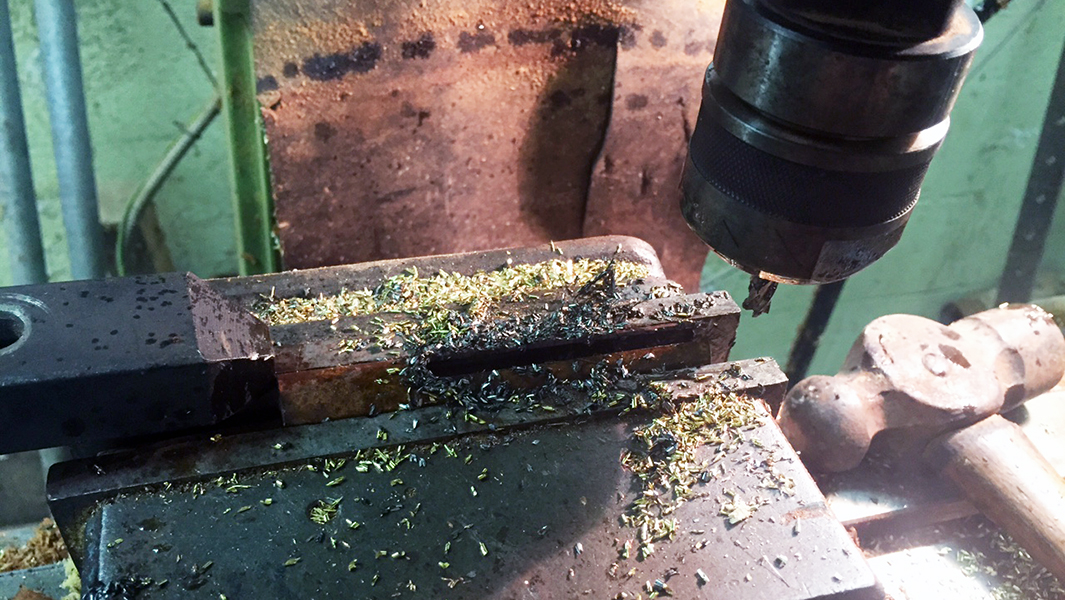
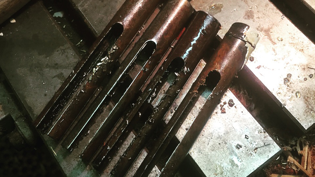
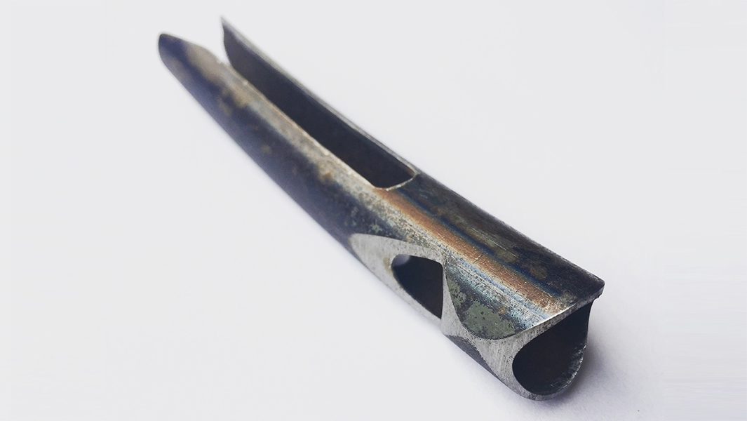
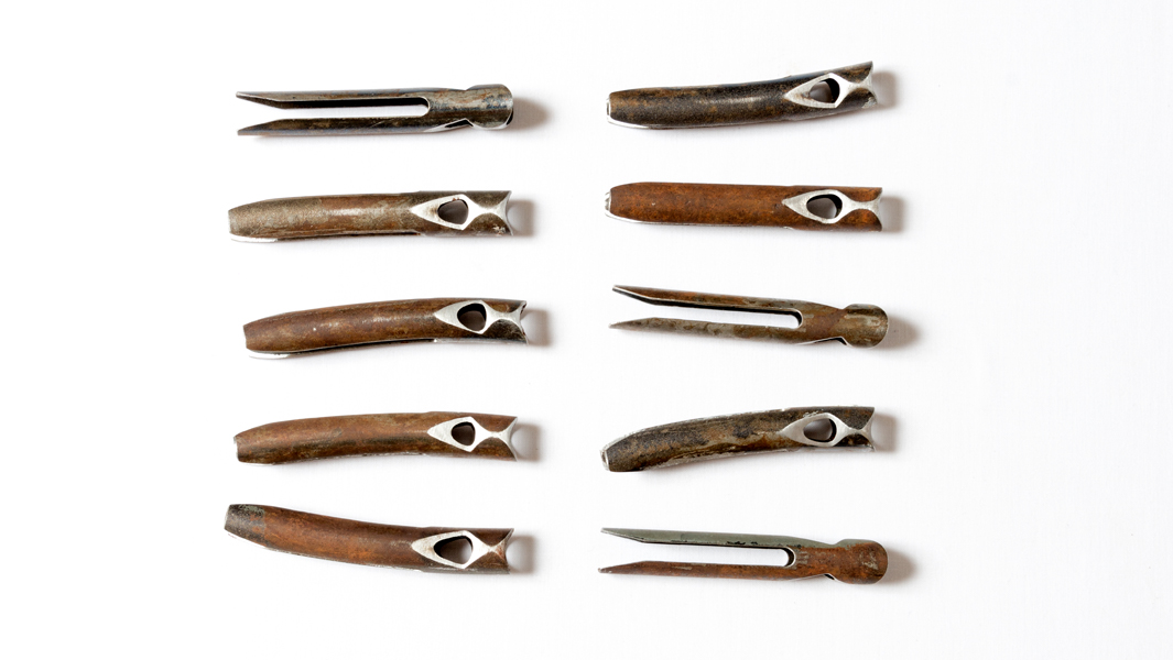
Jane Bowden – Contemporary jeweller, Jane Bowden transforms the discarded wood from a repaired hammer handle into a brooch. The hammer was previously fixed by community repairers Mend It Australia, with some new finishing touches by Bowden. The brooch is for sale with proceeds donated to Mend It Australia.
Blanche Tilden – Contemporary jeweller Blanche Tilden inverts the spout of a vintage teapot to create a mystical elephant headed necklace, giving new style to old. Owned by Kate.
Sera Waters – This rare item of merch from the Melbourne Olympic is repaired by textile artist Sera Waters, giving voice to the intergenerational labour of women. Owned by Heather.
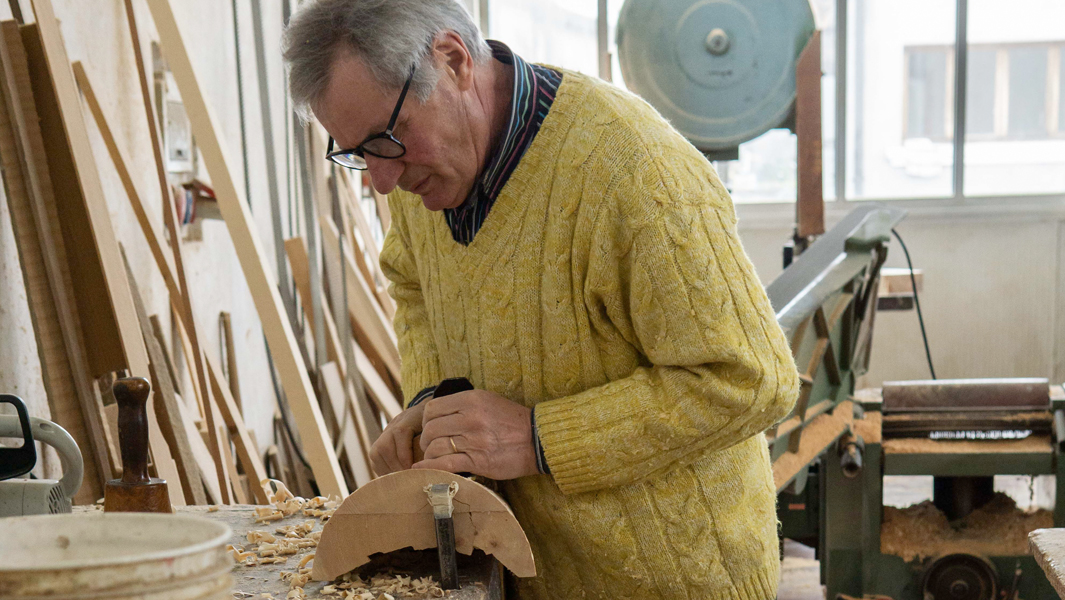
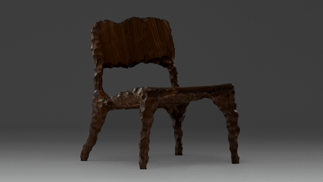
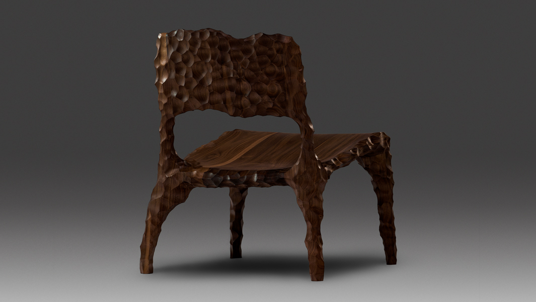
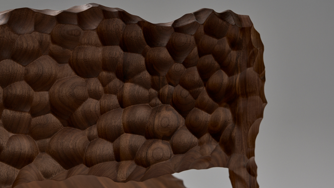
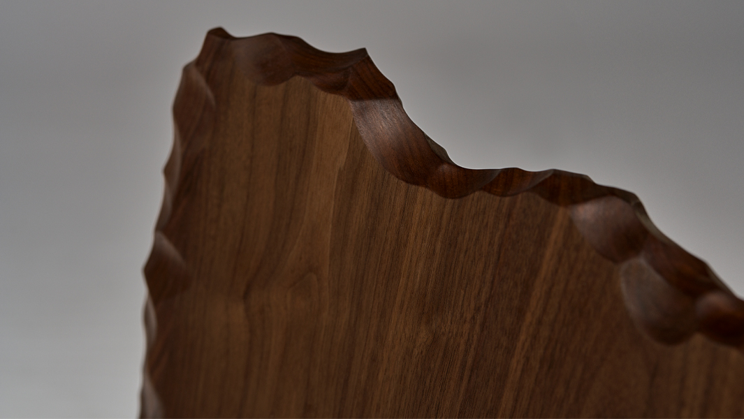
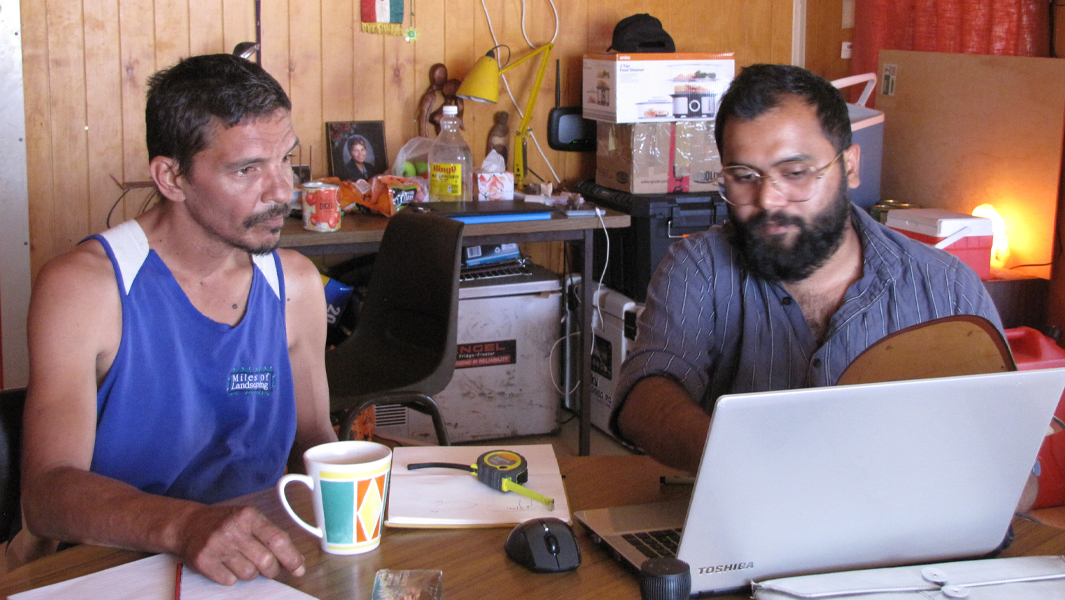
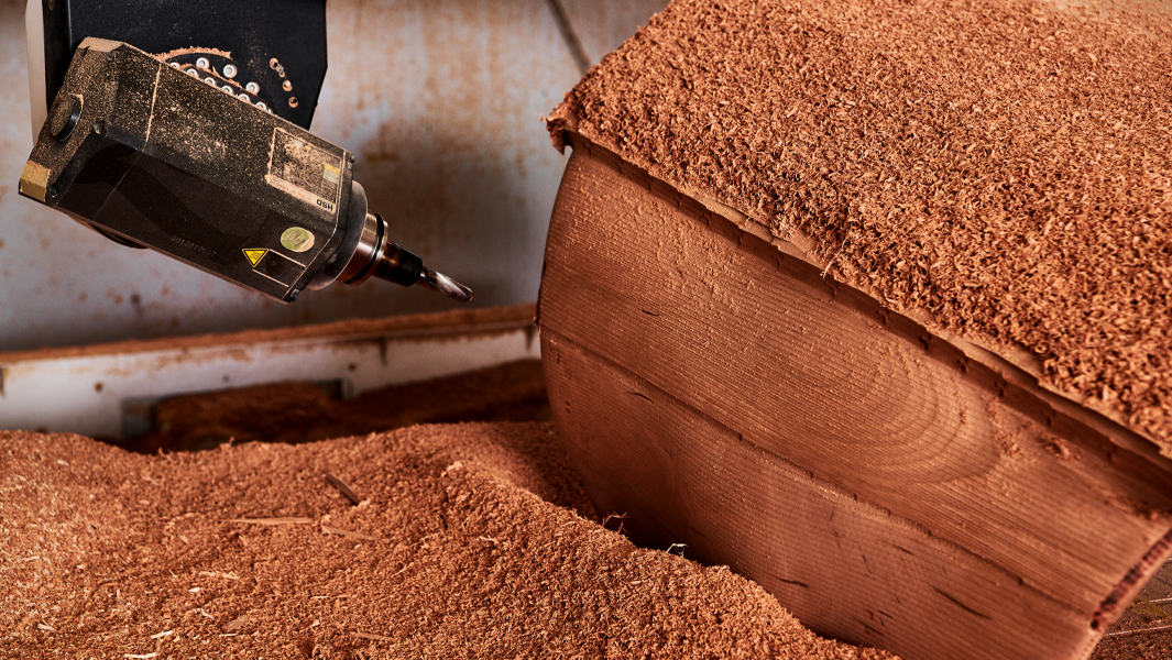
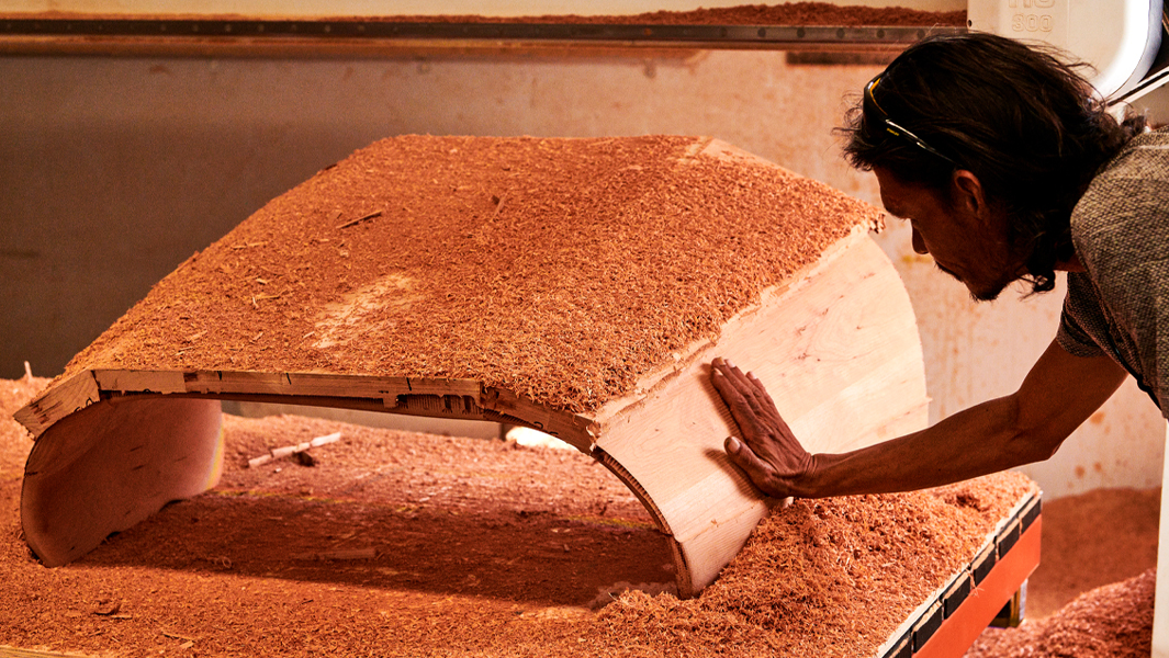
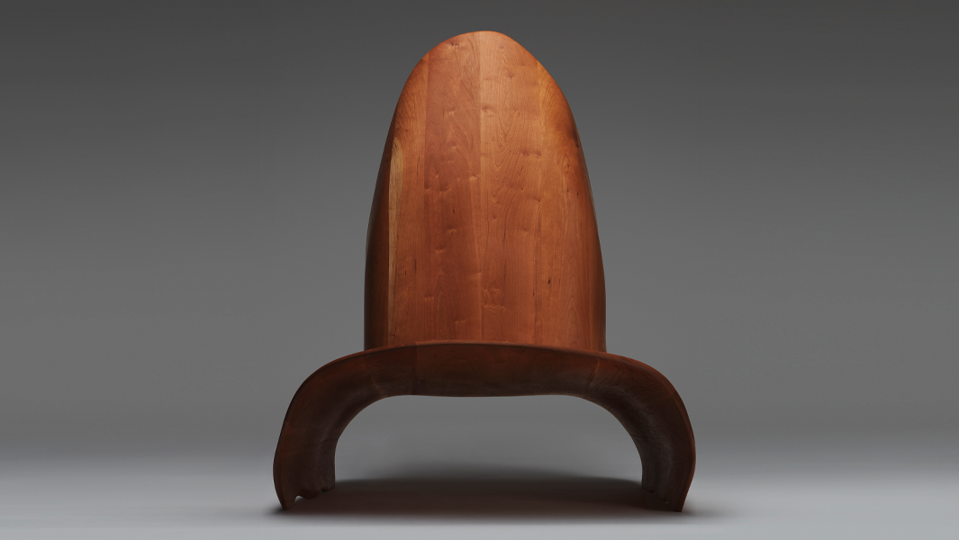
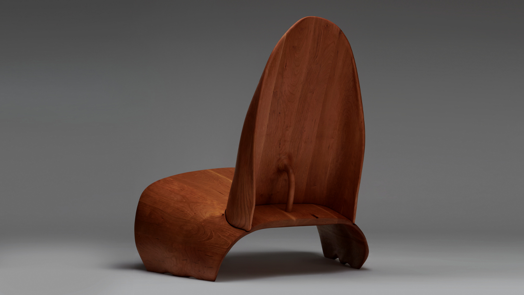
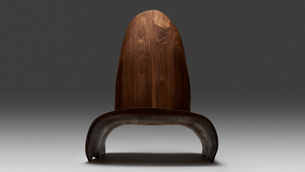
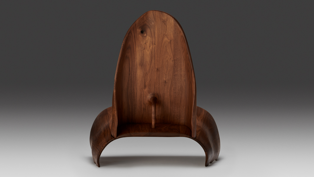
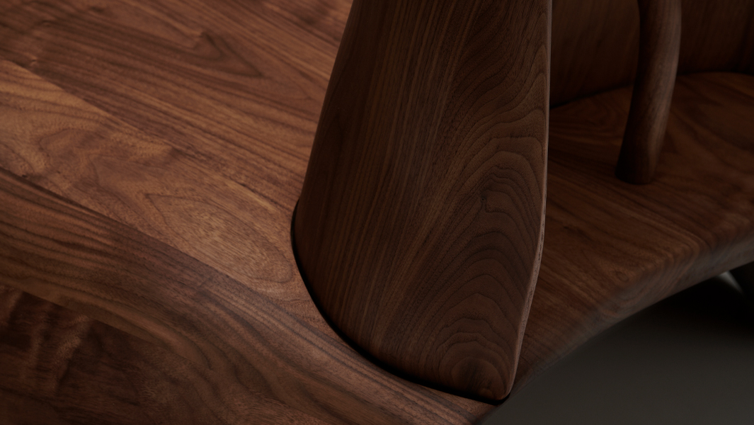
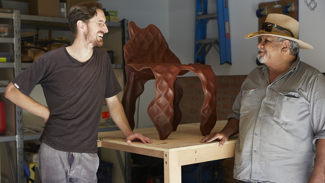
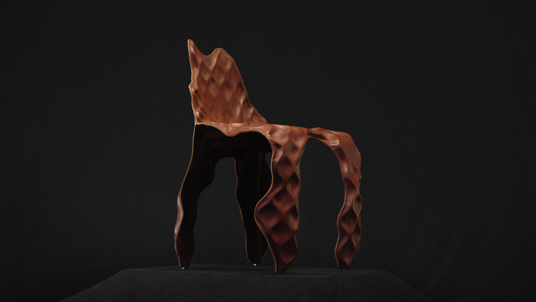
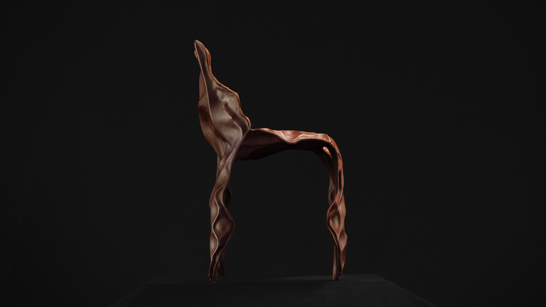
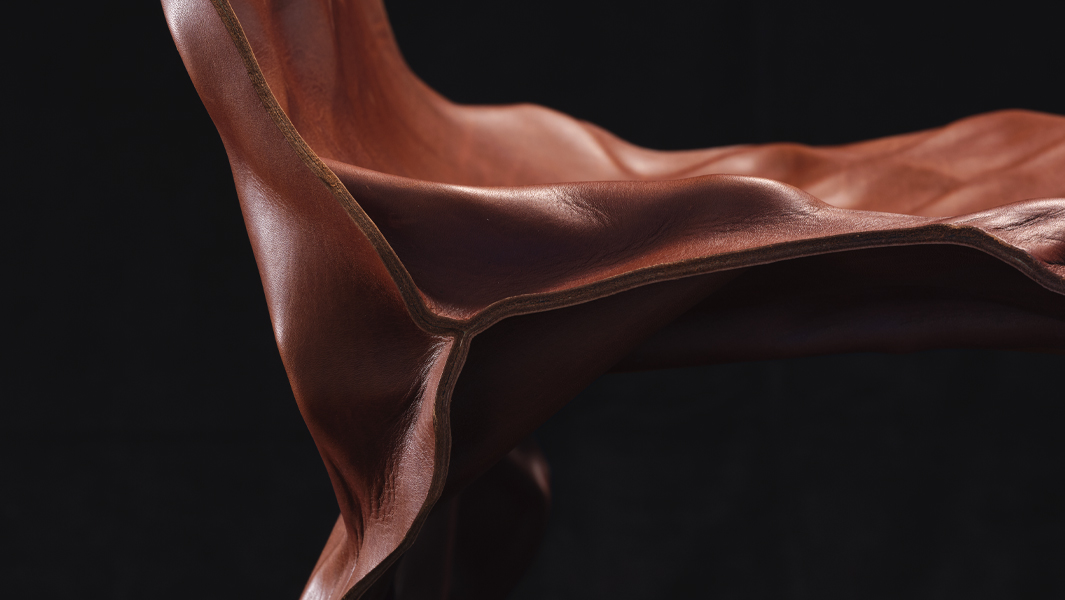
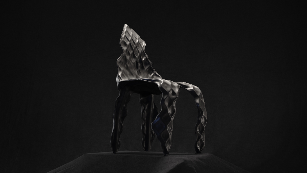
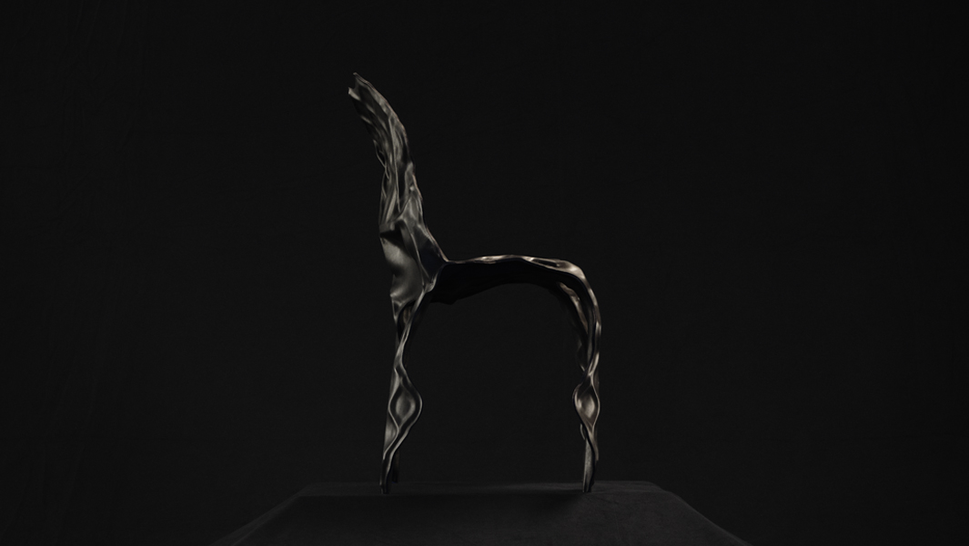
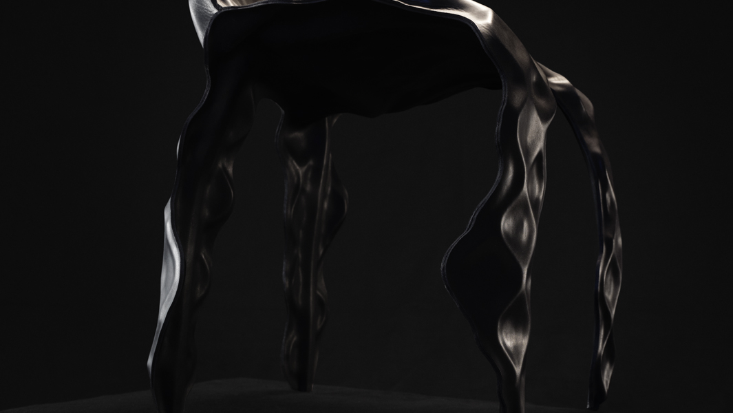
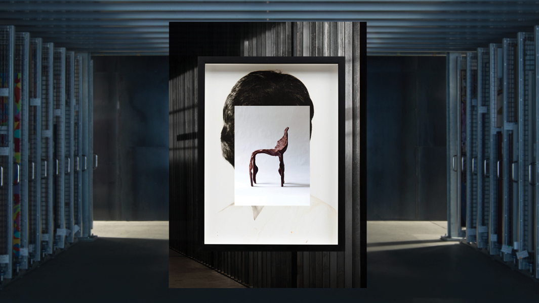
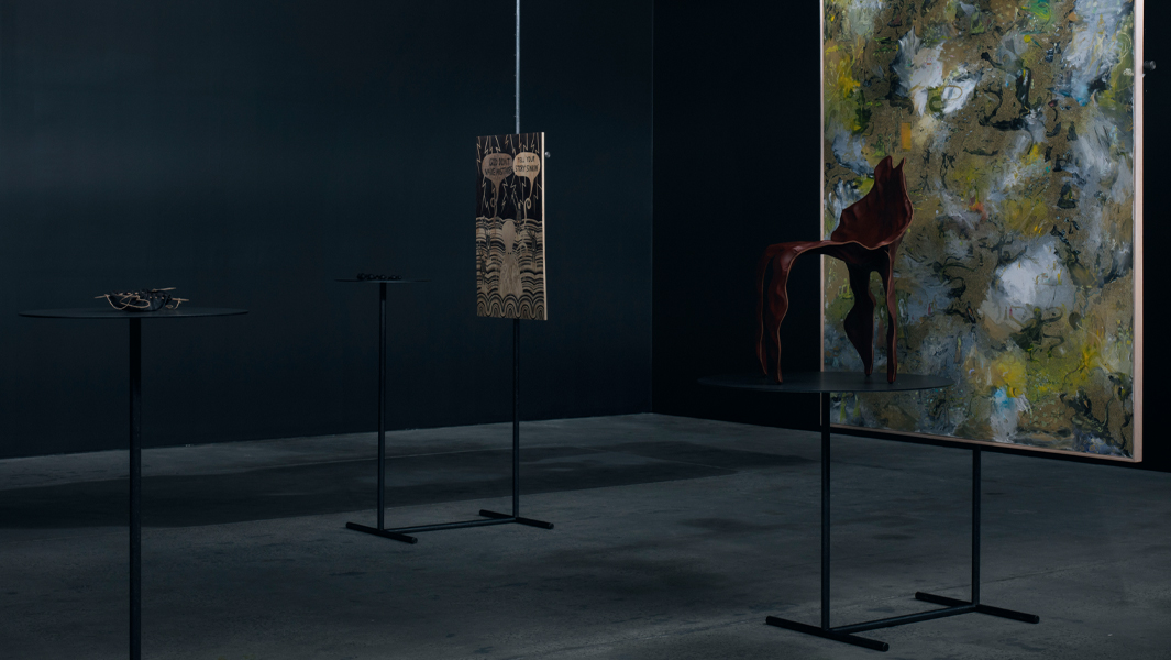
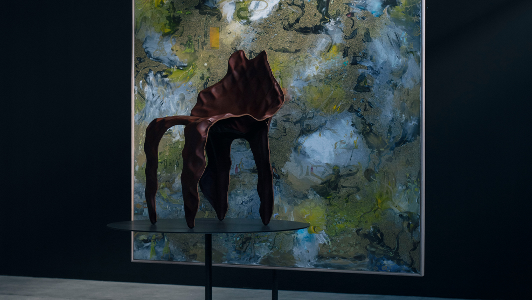
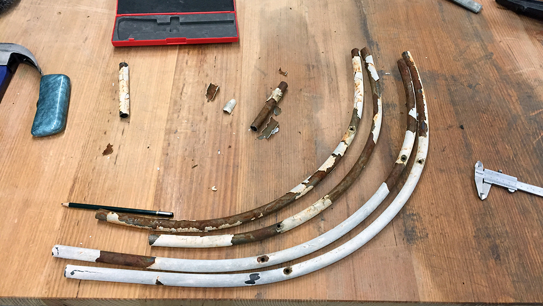
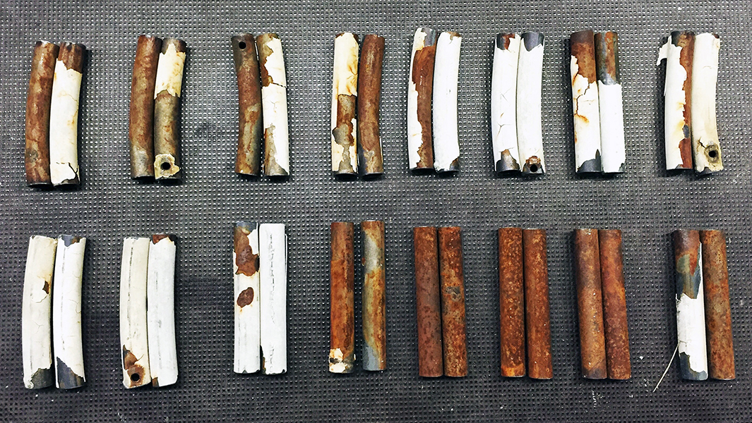
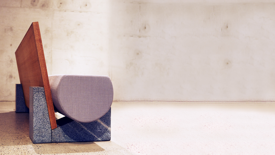
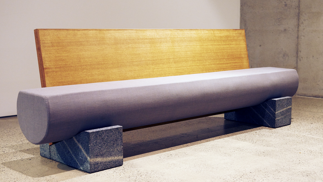
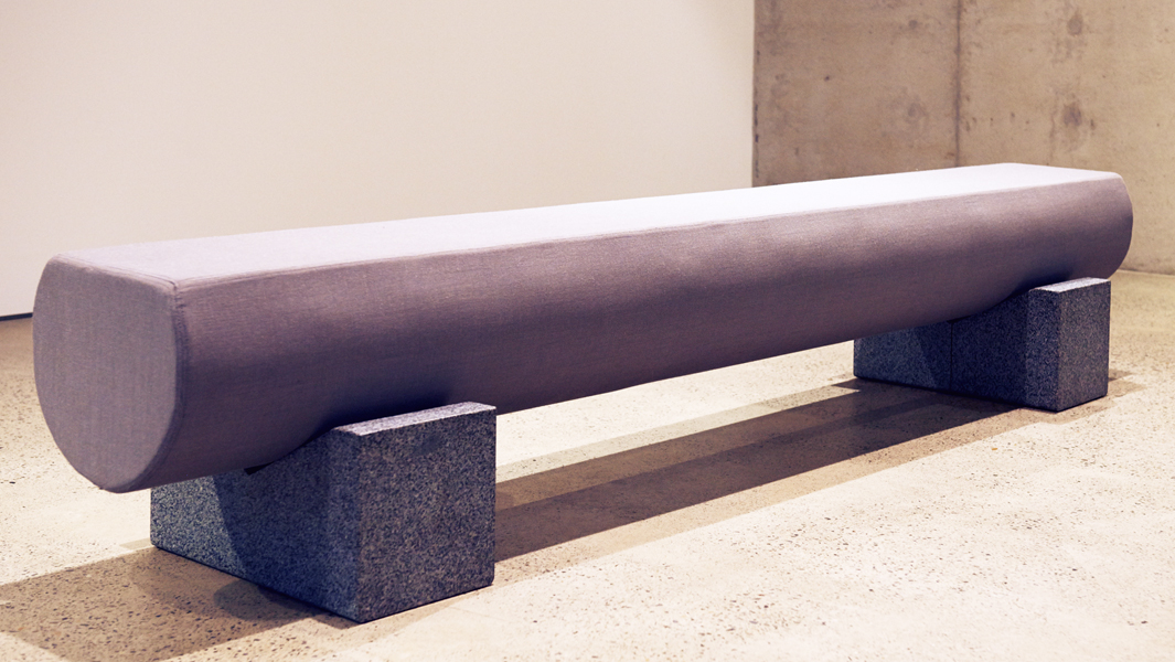
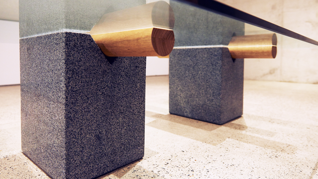
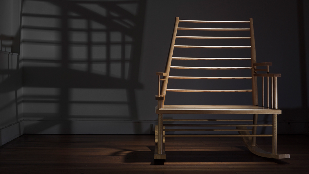
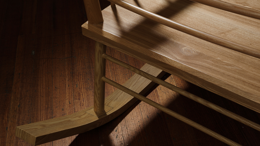
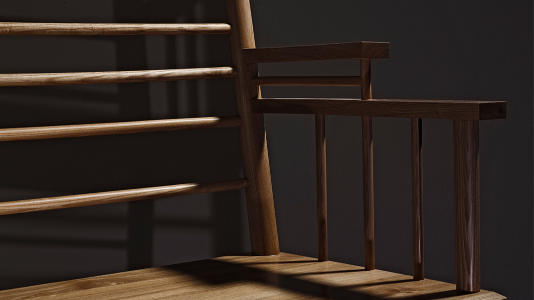
Andrew Carvolth – Last year Khai Liew personally chose designer and craftsperson Andrew Carvolth to repair a broken chair he designed in 2003. Carvolth combined weaving and traditional wood working techniques, many used by Khai himself, to graft a new seat and front legs onto the chair. Owned by a valued client of Khai Liew.
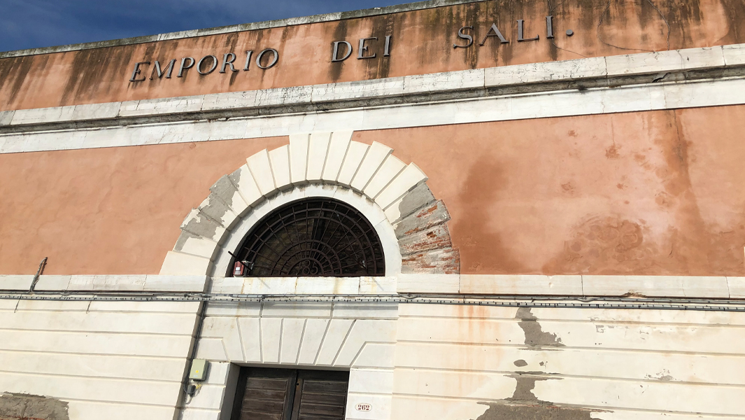
From 5-21 April, 2024 this exciting and eclectic mix of objects was on display at the Jam Factory on Morphett Street in Adelaide.
Words by Guy Keulemans.
Where
Jam Factory,
19 Morphett Street,
Adelaide, SA
Exhibition dates
5 – 21 April 2024
Supporters
Jam Factory
University of South Australia
University of New South Wales
Australian Research Council
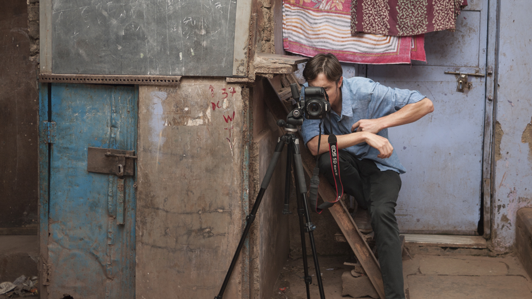
Image Credit – Connor Patterson & Alex Robertson